Walk into any well-preserved Victorian or Edwardian home and the walls tell the story before anything else does. Wallpaper was not an afterthought in these eras — it was one of the first decisions a household made when furnishing a room. The pattern, color, and texture on the walls set the tone for everything that followed: the furniture chosen, the curtains hung, the rugs laid on the floor. It was the foundation of the entire decorative plan.
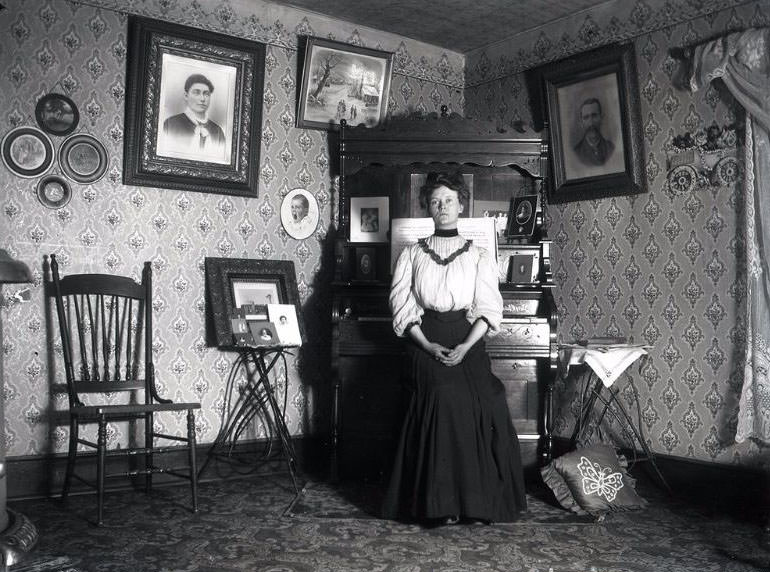
During the late Victorian period, roughly the 1870s through the 1890s, wallpaper production exploded. Machine printing made it far cheaper than it had been earlier in the century, putting decorative walls within reach of the middle class for the first time. Factories in Britain and the United States churned out thousands of designs each year. A family of modest income could now dress their parlor walls in the same rich patterns once reserved for the wealthy.
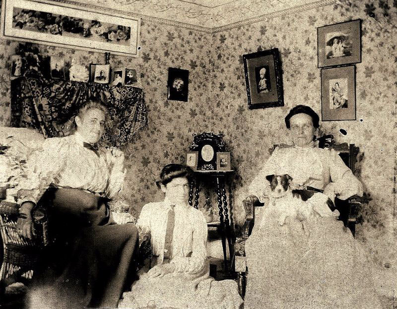
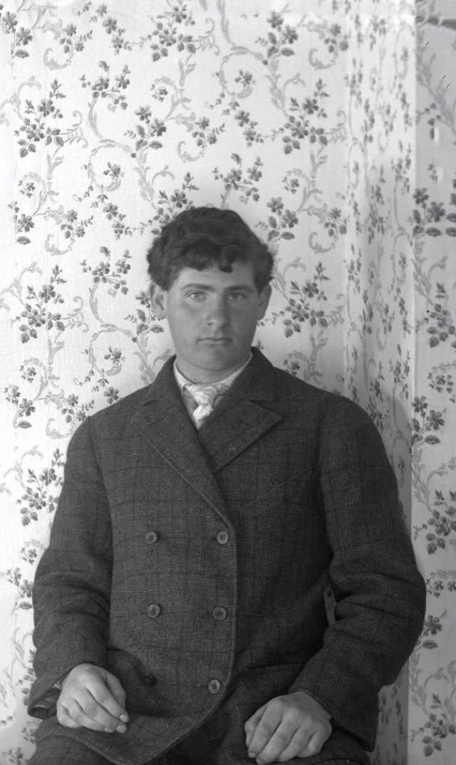
Victorian taste leaned heavily toward bold, layered design. Floral patterns were enormously popular — roses, lilies, and ivy climbing across deep burgundy, forest green, or navy backgrounds. Geometric repeats were common too, often combined with floral motifs in the same paper. The result was walls that felt dense and full, which matched the Victorian preference for rooms packed with objects, textures, and visual interest.
One of the most influential figures in Victorian wallpaper design was William Morris. His firm, Morris & Co., produced hand-printed papers featuring intricate natural patterns — birds, fruit, vines, and leaves drawn with careful detail. Morris believed that everyday objects, including wallpaper, should be beautiful and honestly made. His designs stood apart from the mass-produced machine papers of the time and remain recognizable today.
Rooms in Victorian homes were rarely treated as a single space when it came to wallpaper. Walls were often divided into three horizontal zones: the dado at the bottom, the fill in the middle, and the frieze near the ceiling. Each zone frequently had its own distinct paper or paint treatment. The dado, which ran from the floor to about waist height, was typically covered in a darker, more durable paper to withstand knocks and scuffs.
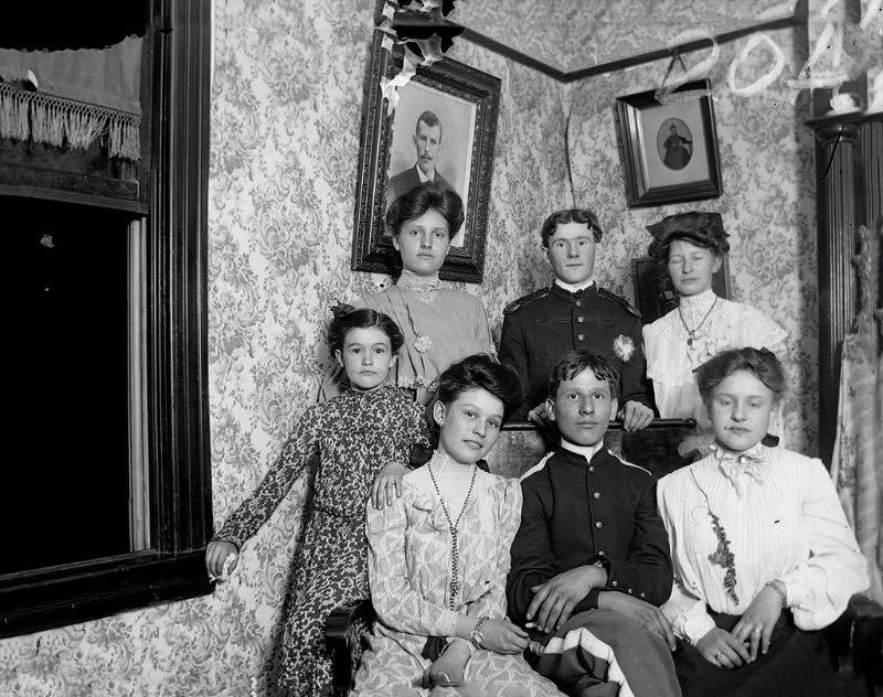
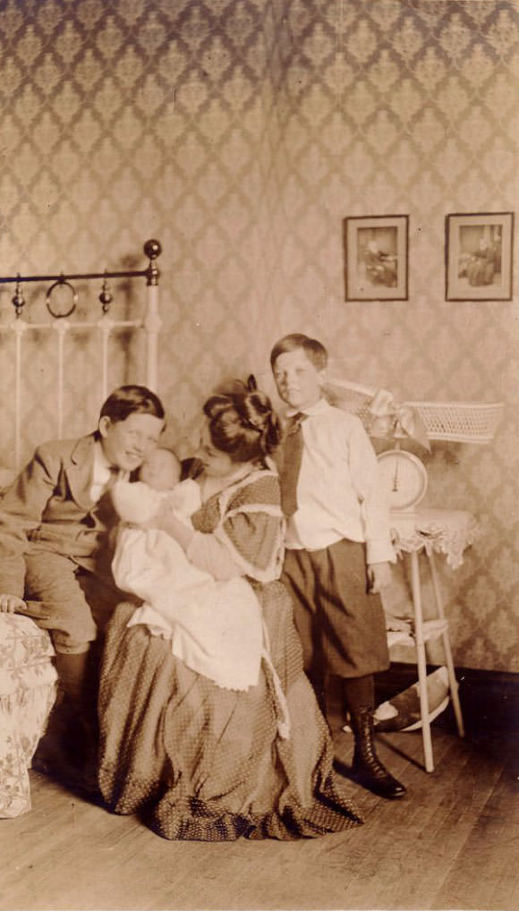
The frieze — the upper band of wall running just below the cornice — gave designers a chance to add a storytelling element. Friezes often depicted landscapes, animals, or continuous floral borders. This zone acted almost like a decorative painting wrapped around the entire room, and it was considered an important finishing detail in well-dressed Victorian interiors.
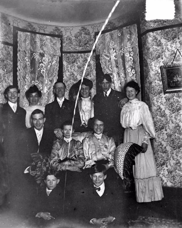
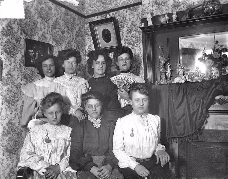
When the Edwardian era began in 1901, wallpaper tastes began to shift. The heavy, dark Victorian palette gave way to lighter, airier designs. Pale greens, soft yellows, creamy whites, and delicate pinks became fashionable. Edwardian rooms felt less cluttered and more refined. Patterns grew simpler — thin vertical stripes, small scattered motifs, and gentle watercolor-style florals replaced the dense repeating designs of the previous generation.
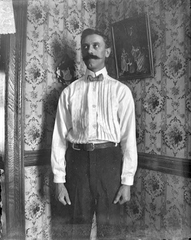
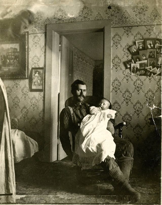
The Arts and Crafts movement, which had roots in the Victorian era, continued to shape Edwardian wallpaper well into the 1900s. Designers under this movement rejected machine excess and favored clean, nature-inspired patterns with clear lines. Stylized tulips, peacock feathers, and geometric plant forms appeared frequently. These designs bridged the gap between the ornate Victorian style and the plainer modernism that would follow after World War I.
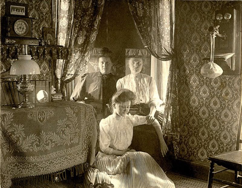
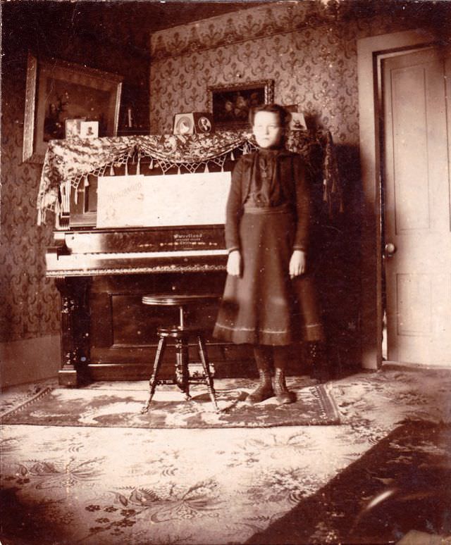
Different rooms in Victorian and Edwardian homes called for different wallpaper choices. The dining room typically featured rich, dark tones thought to stimulate appetite and convey wealth. The drawing room, where guests were received, demanded something more elegant and carefully chosen. Bedrooms used softer patterns and lighter colors. Even hallways and staircases received attention — the paper in these transitional spaces set the mood before a visitor even entered a main room.
Some Victorian wallpapers carried a hidden danger. Certain green papers used a pigment called Scheele’s Green, which contained arsenic. When these papers became damp or deteriorated, they released arsenic-laced dust into the air. The health risks were real, and the debate over arsenic in wallpaper was widely covered in the press during the 1880s. Many manufacturers eventually shifted to safer dyes, though arsenic-based papers remained in use longer than they should have.
Embossed and relief wallpapers added another dimension to interior walls. Products like Lincrusta and Anaglypta were introduced in the 1870s and 1880s. Lincrusta was made from a linseed oil compound pressed into solid relief patterns and could be painted over in any color. Anaglypta, lighter and cheaper, was made from cotton pulp and also designed to be painted. Both were especially popular for dado sections and hallways where durability mattered.
Trade catalogues from the period show just how many options were available to a Victorian or Edwardian buyer. Publishers like Jeffrey & Co. and Sanderson produced yearly pattern books that decorators and homeowners browsed to select their walls. Prices varied widely — a basic machine-printed paper cost just pennies per roll, while a hand-blocked specialty paper from a prestigious firm ran to several shillings. The market served everyone from modest terraced houses to country estates.
Interior design manuals of the time gave detailed guidance on how to select and coordinate wallpaper. Books like Charles Eastlake’s Hints on Household Taste, published in 1868, told middle-class readers exactly which patterns were refined and which were considered vulgar. These publications had real influence. A well-read homeowner knew that a restless, over-shaded floral pattern was considered poor taste, while a flat, well-defined geometric design signaled educated choice.
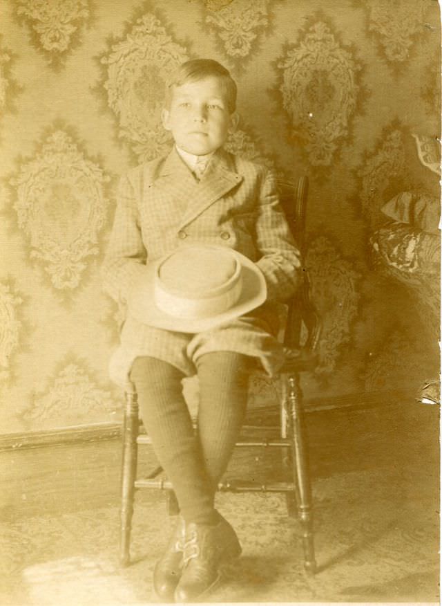
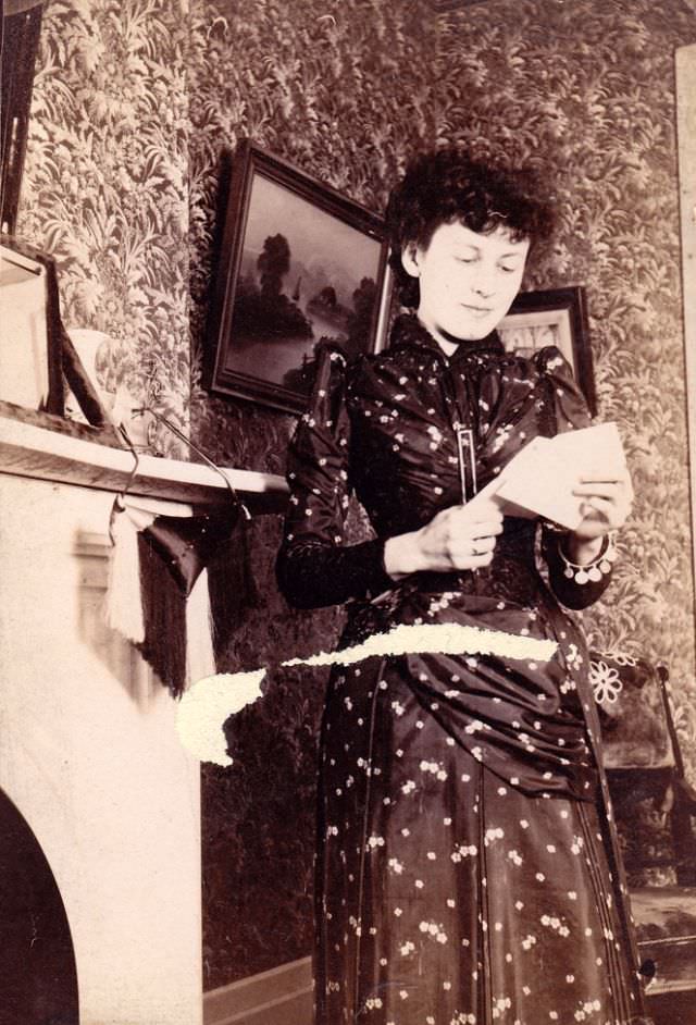
Wallpaper also reflected the broader cultural interests of the Victorian age. Japan had opened its ports to Western trade in the 1850s, and Japanese art flooded into Britain and America. By the 1870s and 1880s, Japonisme — the craze for Japanese-inspired design — had worked its way onto wallpaper. Fans, cranes, cherry blossoms, and bamboo appeared on parlor walls across Britain and the United States. This style was called the Aesthetic Movement, and it produced some of the most distinctive wallpaper of the entire Victorian era.
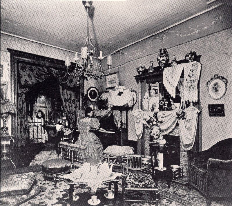
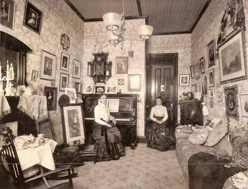
Children’s rooms received their own specialized papers by the later Victorian period. Nursery wallpapers featured illustrated scenes — nursery rhyme characters, animals, toy soldiers, and fairy tale figures. Kate Greenaway and Walter Crane, both celebrated illustrators, contributed designs that were printed as wallpaper friezes specifically for nurseries. These papers treated children’s spaces as worthy of real artistic attention, not just leftover adult designs.
The act of hanging wallpaper was skilled work. Professional paperhangers were employed by middle and upper class households, while working class families often hung paper themselves. Paste was made at home from flour and water. Getting a pattern to match at every seam required patience and precision. A poorly hung paper with misaligned repeats was visible and embarrassing. The craft mattered as much as the design itself.
Exhibitions played a major role in spreading wallpaper trends. The Great Exhibition of 1851 at Crystal Palace in London featured elaborate wallpaper displays from manufacturers around the world. International expositions held in Paris, Vienna, and Philadelphia throughout the second half of the 19th century also showcased new designs. These events directly fed public taste and encouraged manufacturers to push into new territory with pattern, texture, and color.
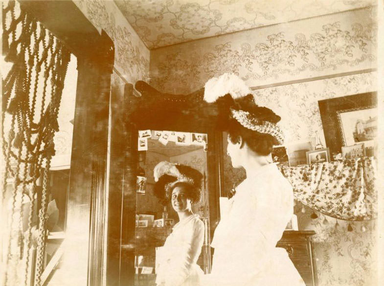
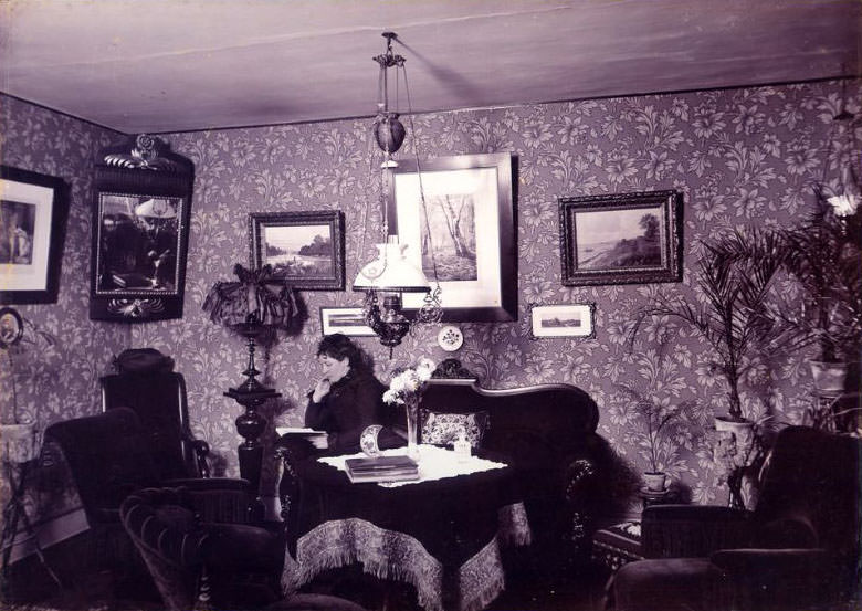
By the Edwardian period, the three-part wall treatment of the Victorians was falling out of fashion in many households. Simpler approaches — a single paper from baseboard to cornice, perhaps finished with a painted border — became more acceptable. The growing influence of interior decorators as a profession meant that fewer homeowners were relying solely on their own taste. Coordinated room schemes, where wallpaper, paint, and fabric were selected together, became the expected standard.
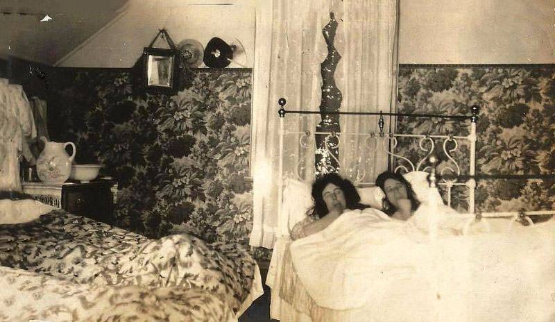
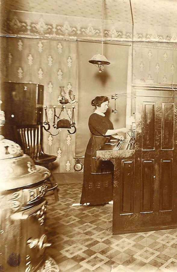
Pattern books and sample collections preserved in museums today give historians a clear record of what was produced and sold. The Victoria and Albert Museum in London holds one of the largest collections of Victorian and Edwardian wallpaper samples in the world. These physical records show the full range of quality, style, and price that was available across both eras — from rough machine-printed papers intended for servants’ quarters to elaborate hand-blocked luxury designs made for grand houses.
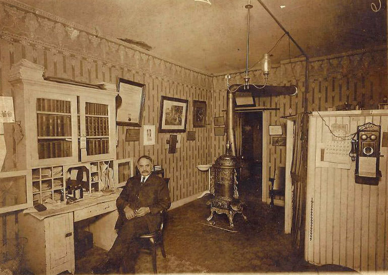
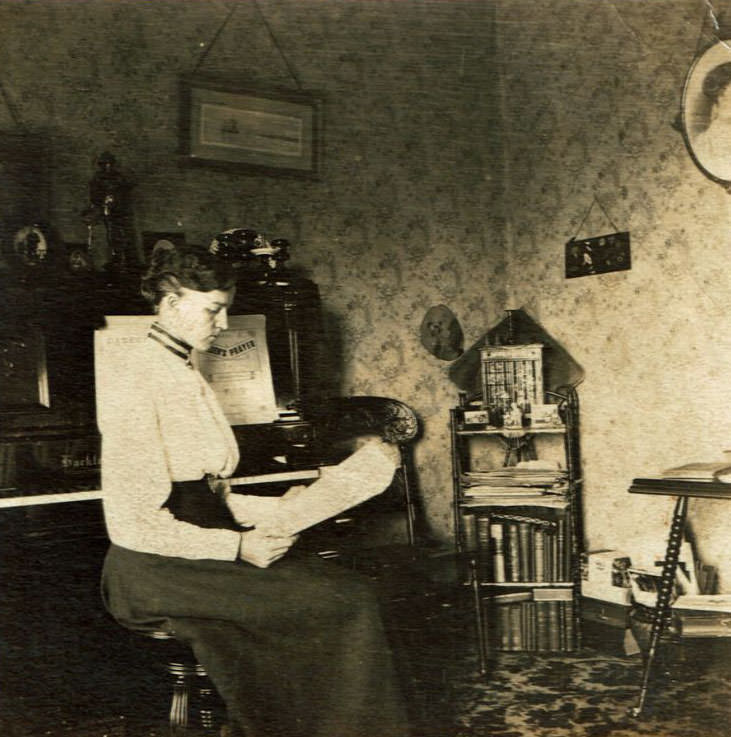
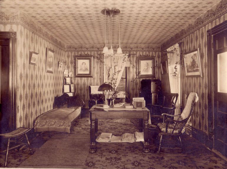
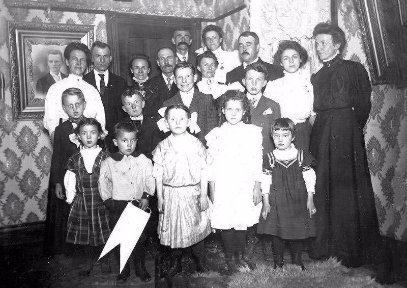
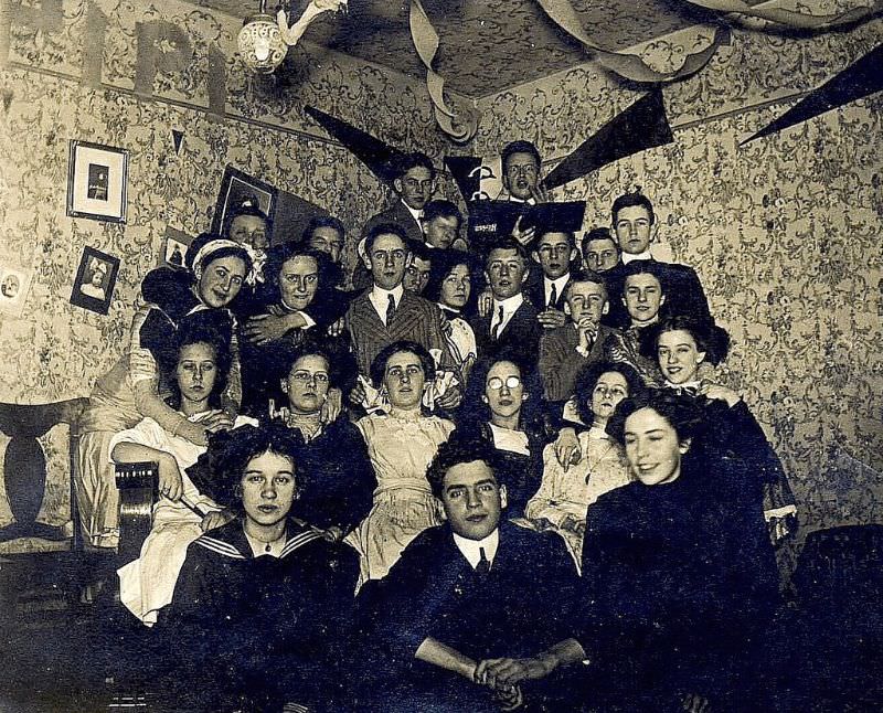
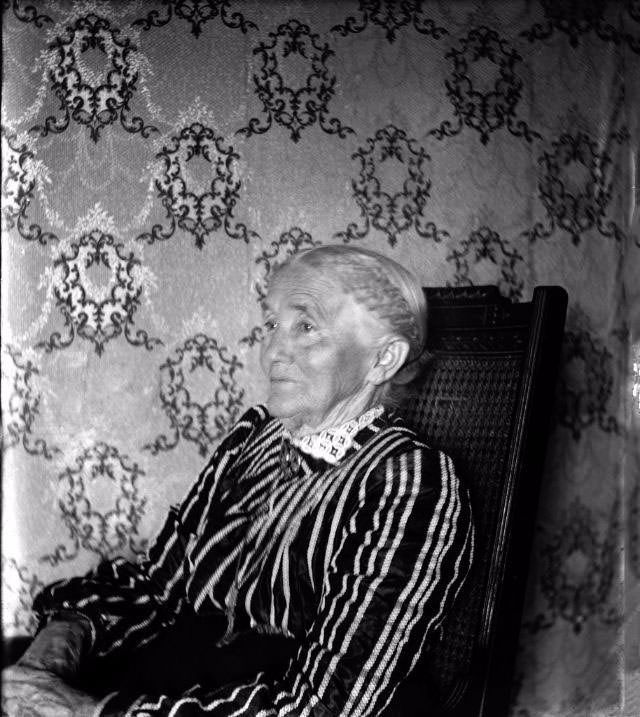
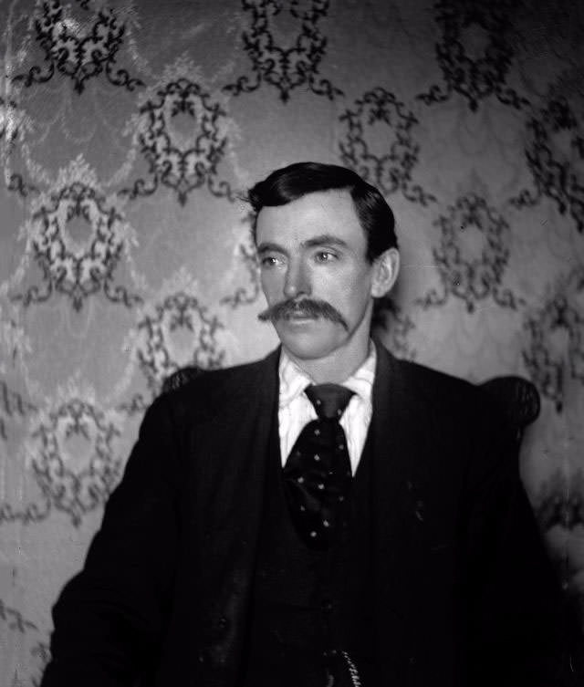
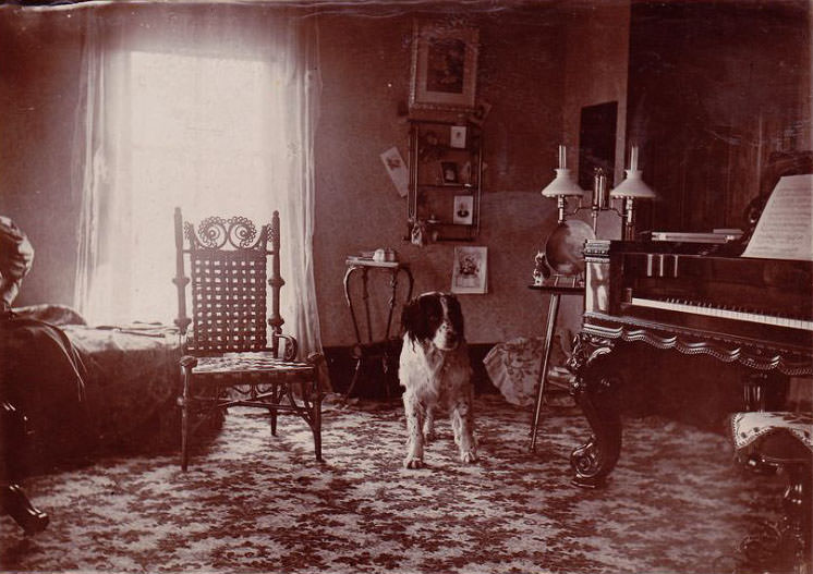
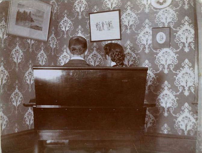
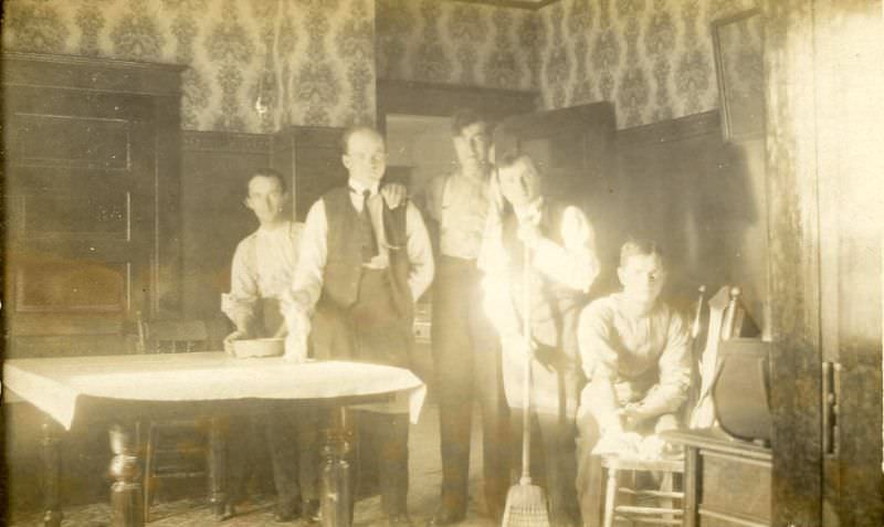
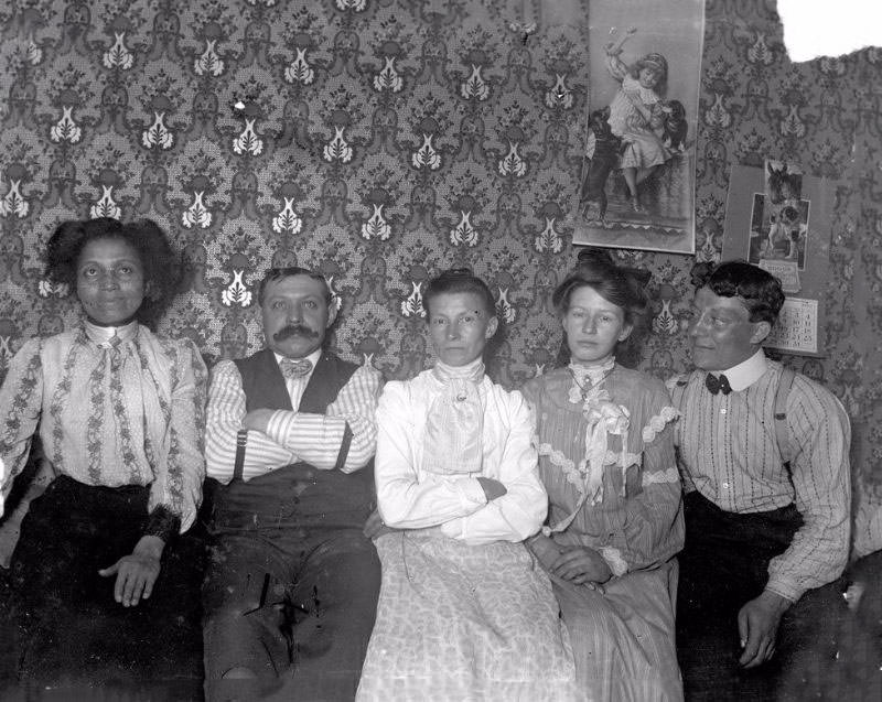
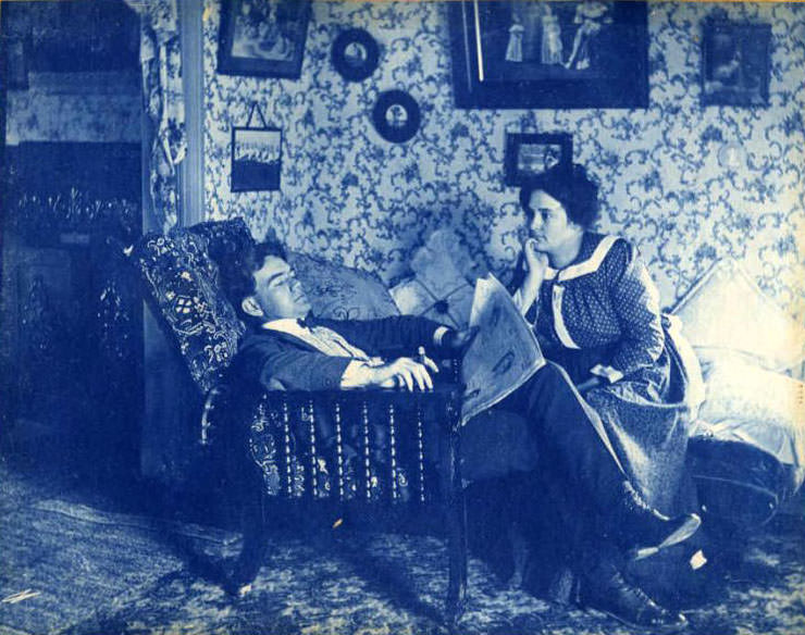
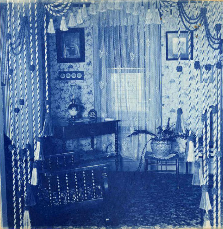
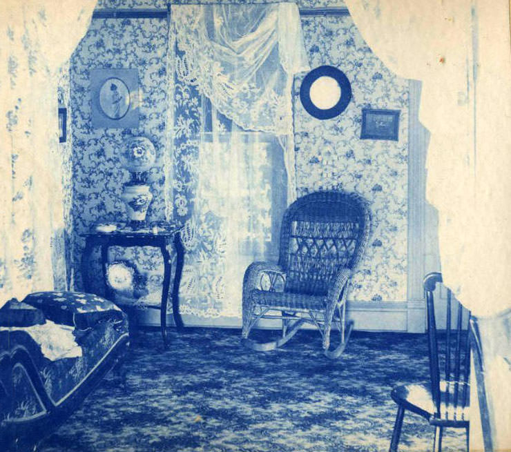
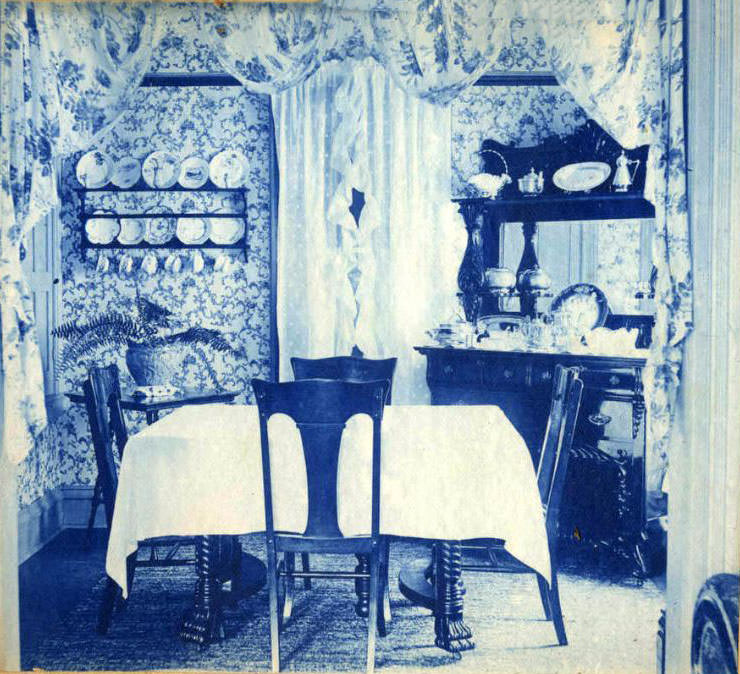
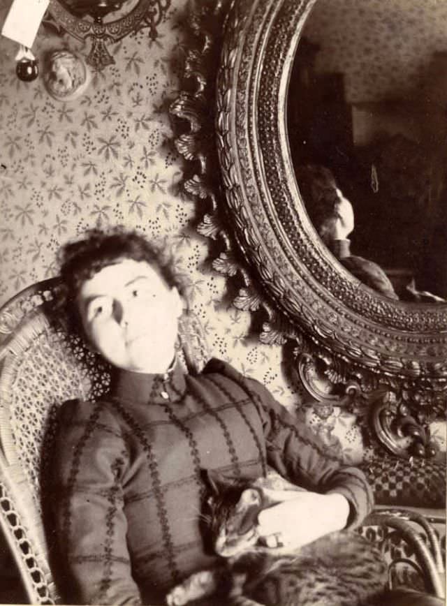
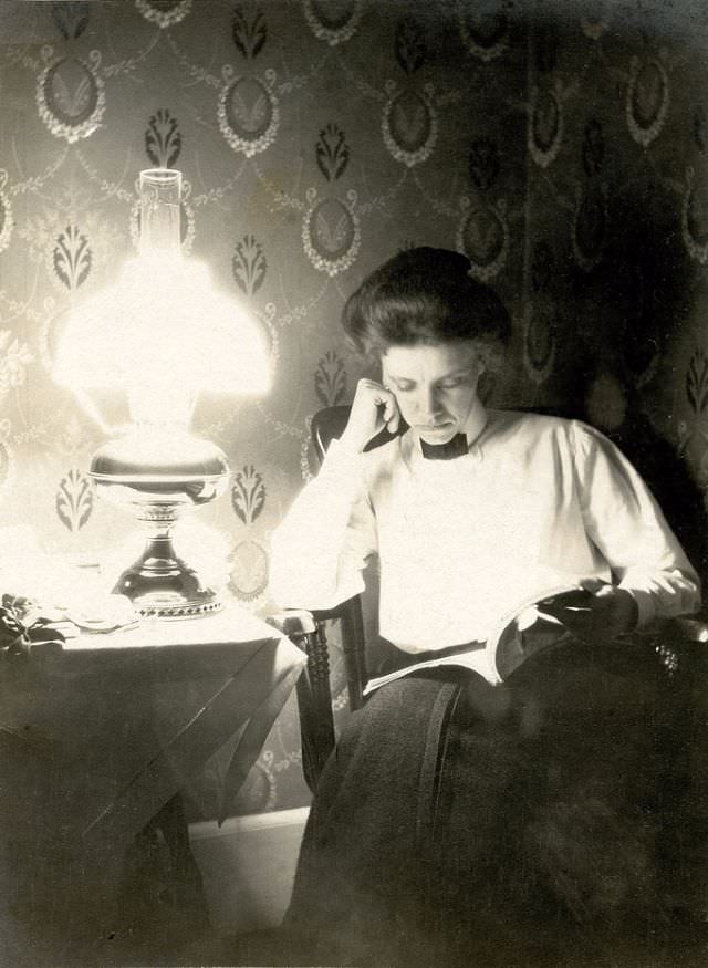
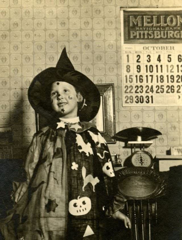
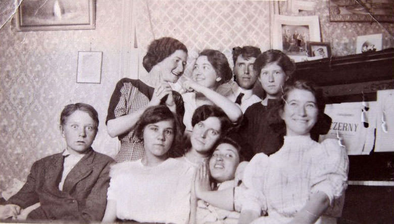
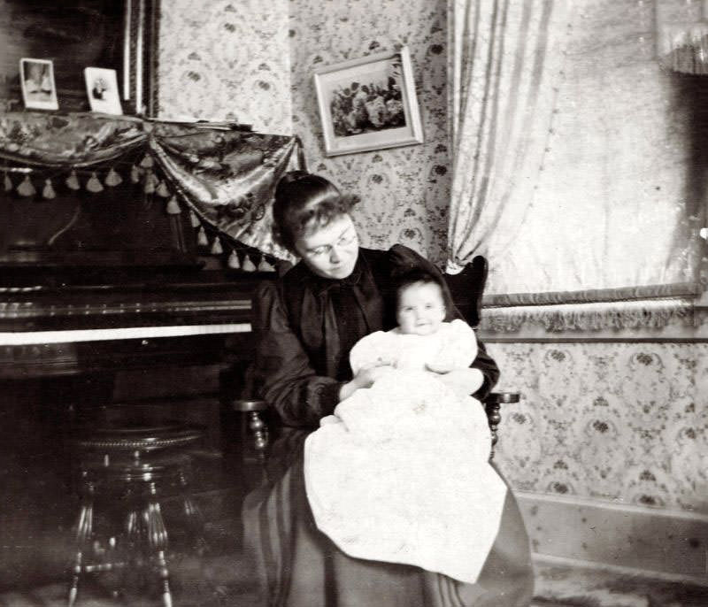
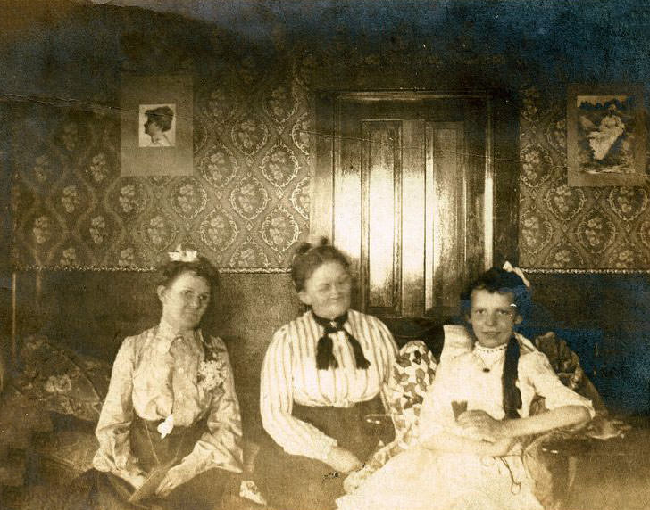
Surviving photographs of Victorian and Edwardian interiors show wallpaper as a constant presence in every room type. Even kitchens and back hallways in wealthier homes received some form of patterned paper. In working class terraced houses, a single affordable paper in the front parlor served as a mark of domestic respectability. The presence of wallpaper, regardless of its cost, signaled that a household cared about its appearance and took pride in its home.
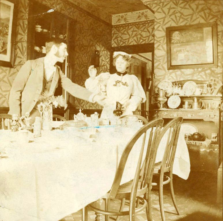
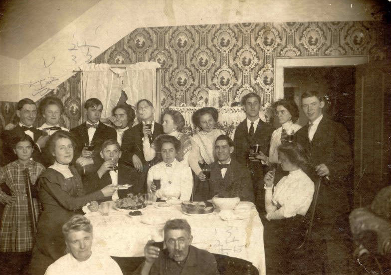
The photographs collected here offer a direct look at the wallpaper styles that defined these two eras. Each image captures a specific design sensibility — a particular arrangement of color, pattern, and texture that was considered correct and desirable for its time. Together they document how seriously homeowners of the Victorian and Edwardian ages treated their walls, and how much thought went into what most people today would consider simply the background of a room.