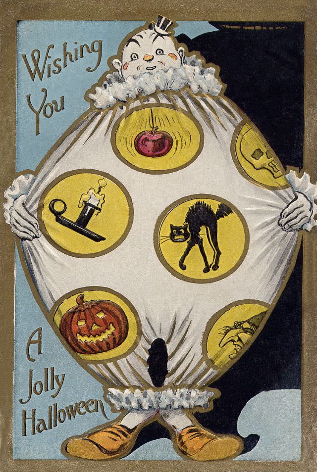
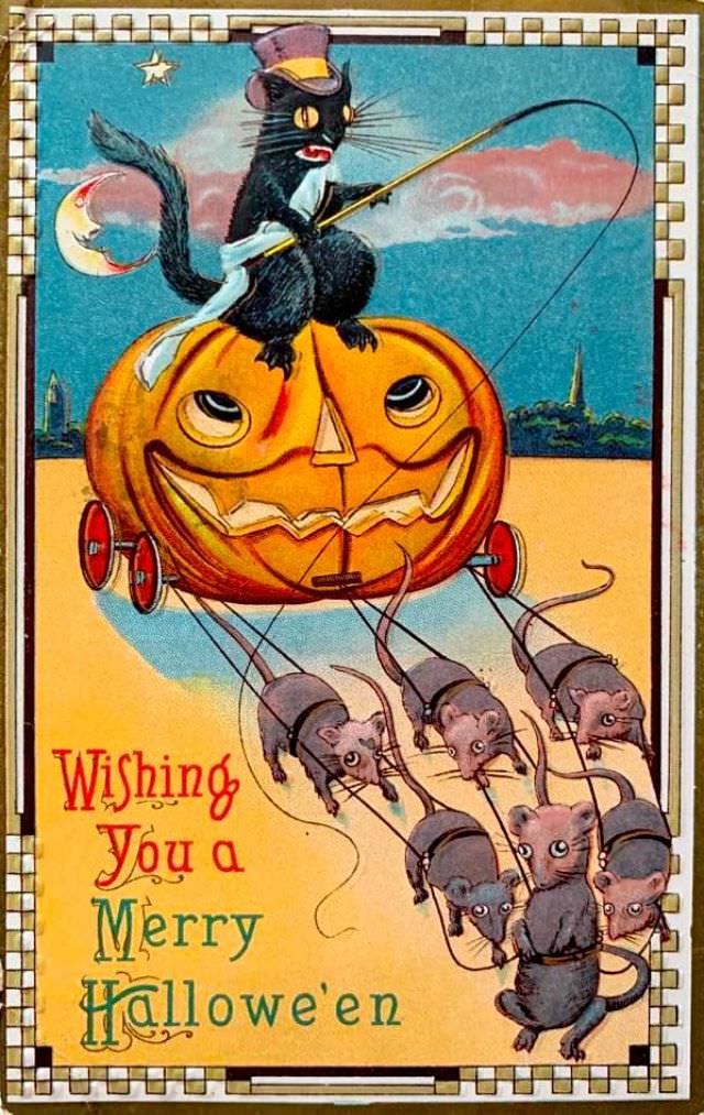
Between 1900 and 1915, Halloween postcards had their golden age. Publishers across the United States and Europe printed millions of them, sending the holiday’s symbols — witches, black cats, glowing jack-o’-lanterns, and grinning ghosts — straight into people’s mailboxes. These cards weren’t just seasonal greetings. They were a window into how ordinary people celebrated and thought about Halloween at the turn of the century.
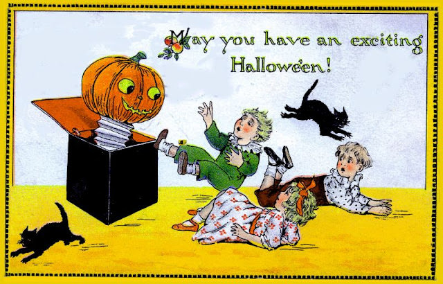
The designs were colorful, playful, and rooted in folklore. Witches rode broomsticks across harvest moons. Owls perched on bare branches. Young women performed old superstition rituals, hoping to catch a glimpse of their future husbands. The mood was festive rather than frightening — Halloween was portrayed as a communal holiday full of fun and mystery, not the horror-heavy event it would later become.
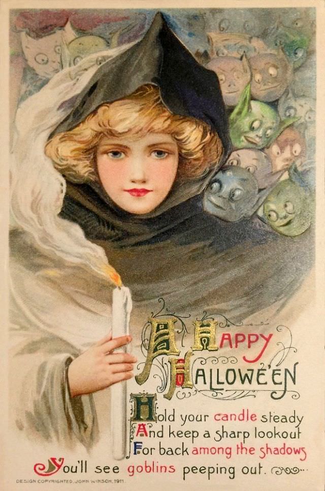
Major publishing companies drove this postcard boom. John Winsch, Raphael Tuck & Sons, and the Gibson Art Company were among the most prominent producers. Their cards were widely distributed and affordable, putting beautifully illustrated Halloween art within reach of nearly everyone. Artists working for these companies developed bold, distinctive styles that collectors still prize today.
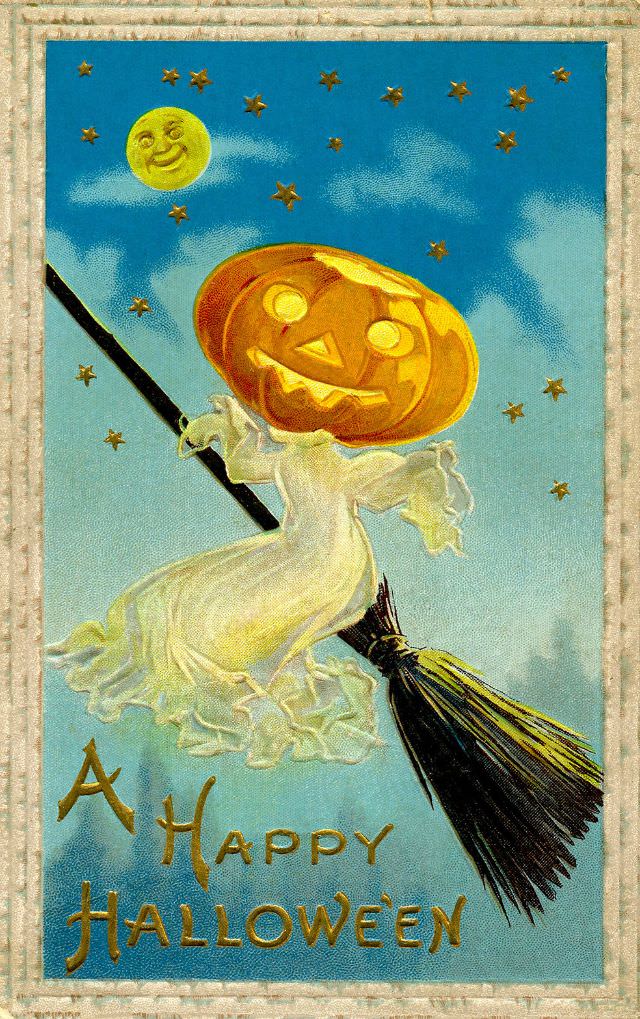
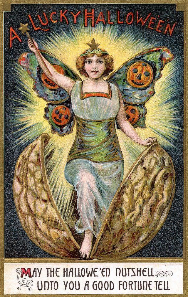
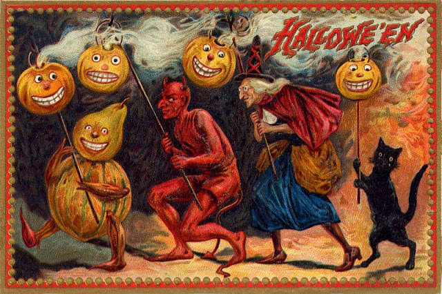
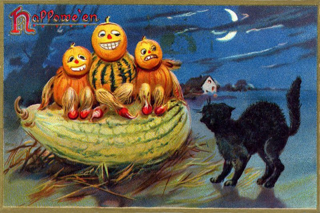
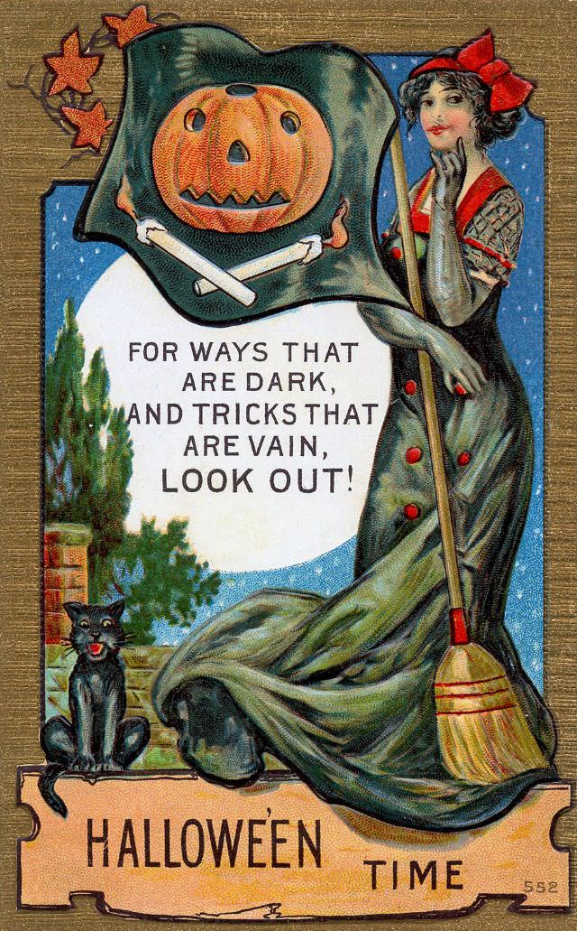
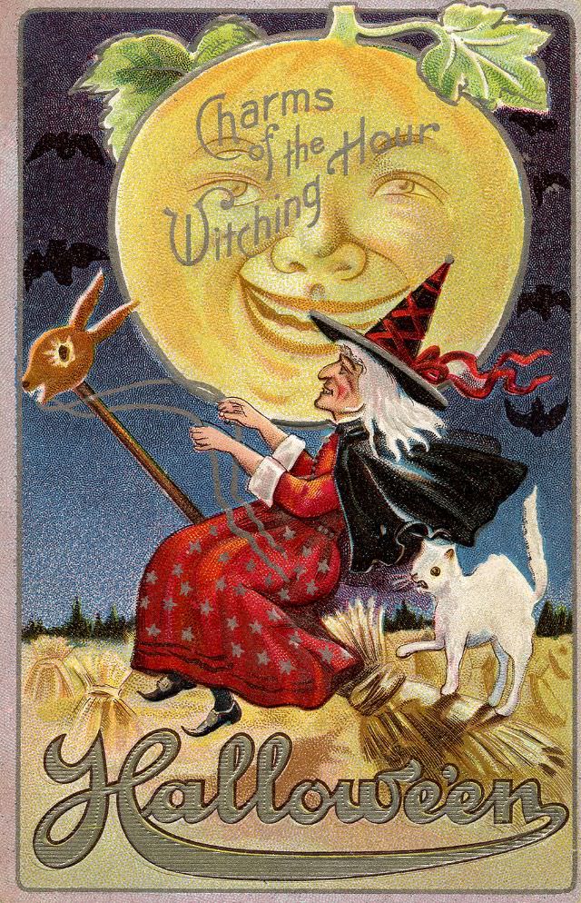
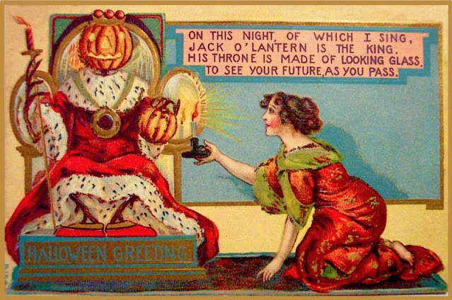
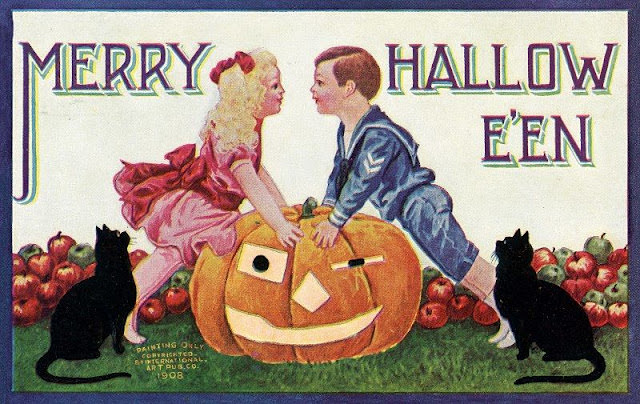
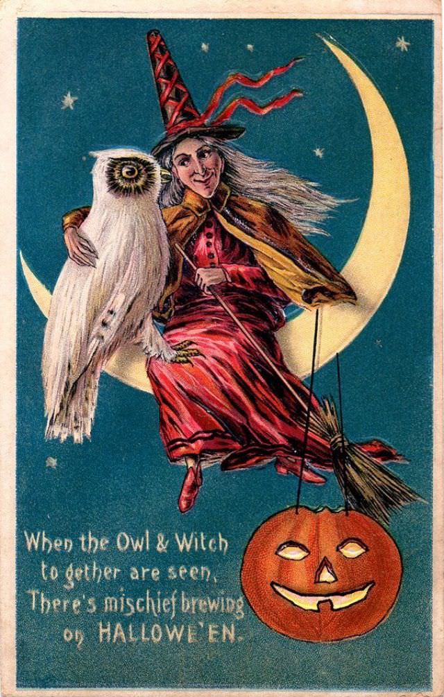
Common symbols appeared again and again across different publishers and artists. The jack-o’-lantern was king. Witches in tall black hats were everywhere. Black cats arched their backs beneath glowing moons. These images weren’t random — they drew directly from centuries of folk belief and Halloween tradition, giving the cards a sense of cultural depth beneath their cheerful surfaces.
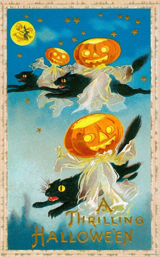
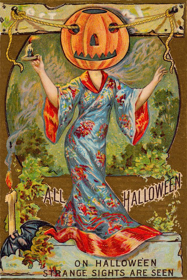
Many cards carried short verses or playful phrases printed right on the front. Lines like “Charm of the Witching Hour” or “Strange Sights are Seen” gave the cards a storybook quality. They were meant to delight the recipient, not unsettle them. The spooky elements were always balanced with warmth and good humor.
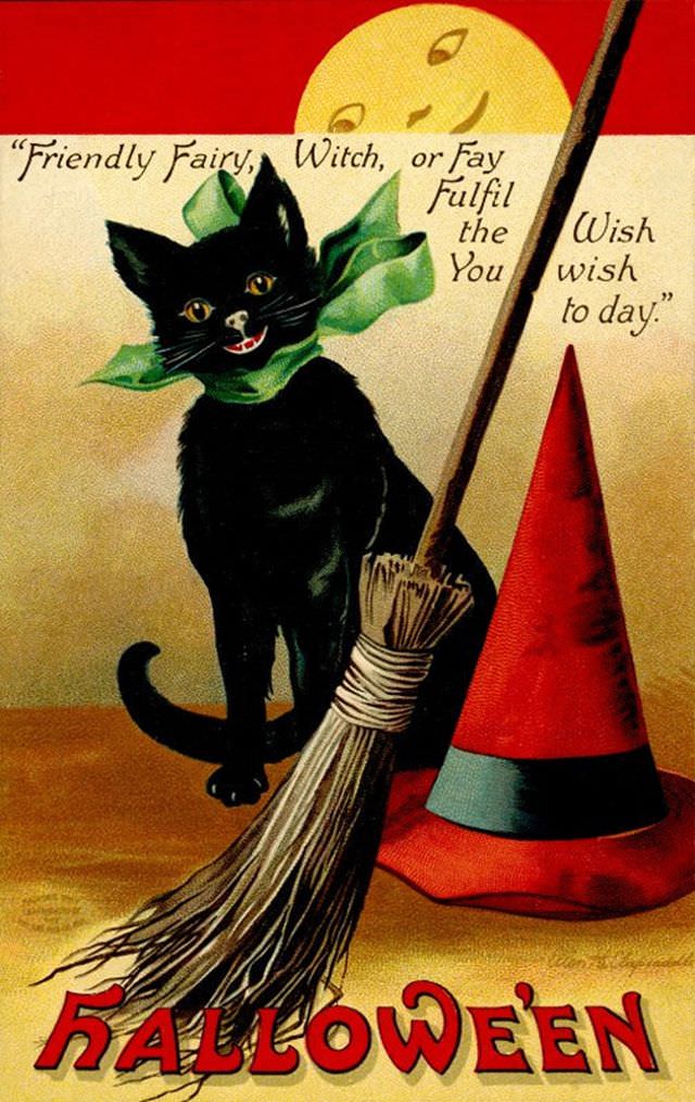
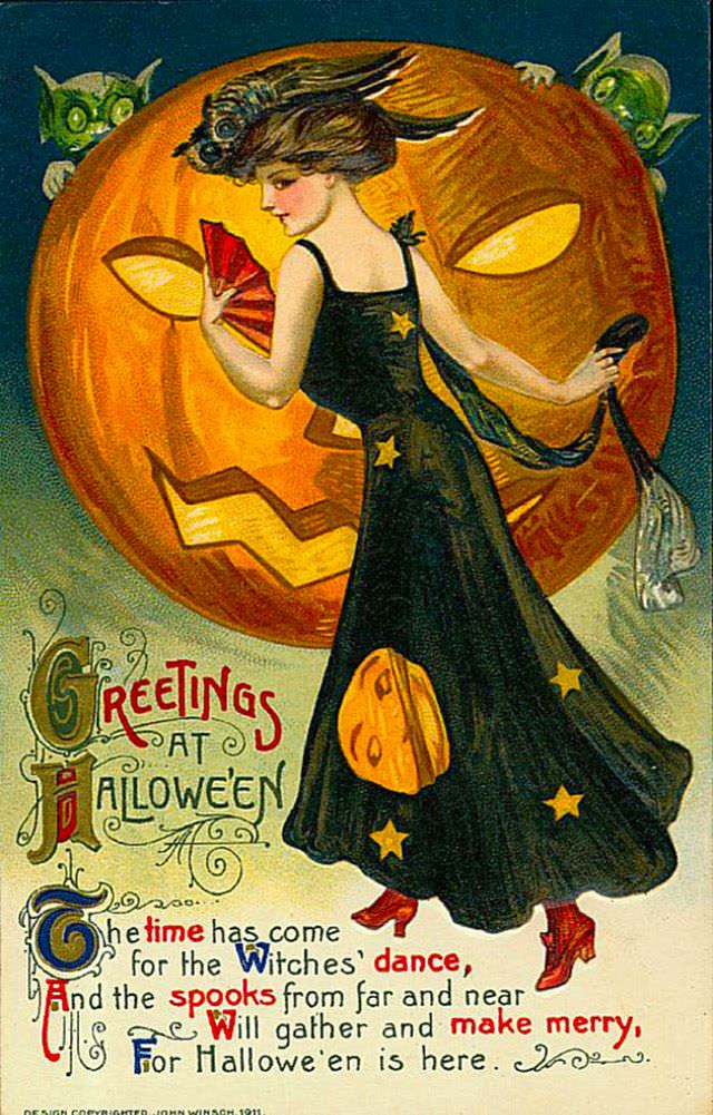
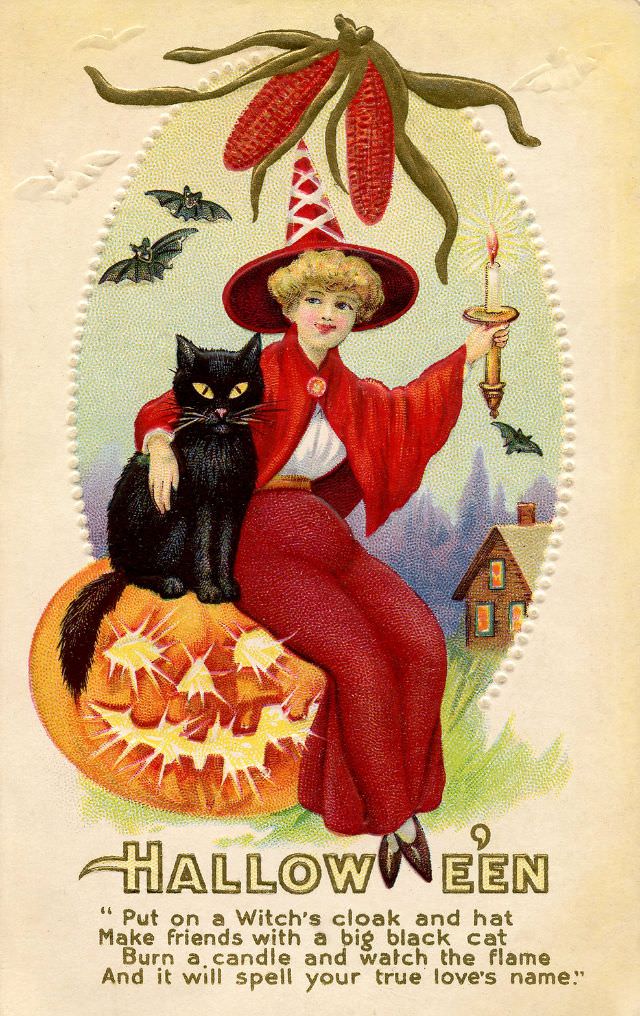
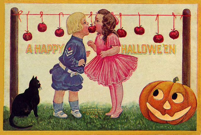
The postcards also reflect Halloween’s growing role as a social occasion. Parties, costumes, and group celebrations were common themes. Cards depicted young people bobbing for apples, dancing around bonfires, or gathering beneath lantern light. Halloween was becoming a mainstream American holiday, and these postcards helped spread that identity coast to coast.
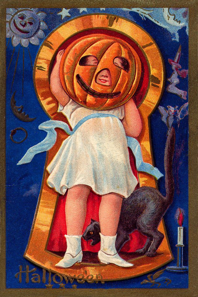
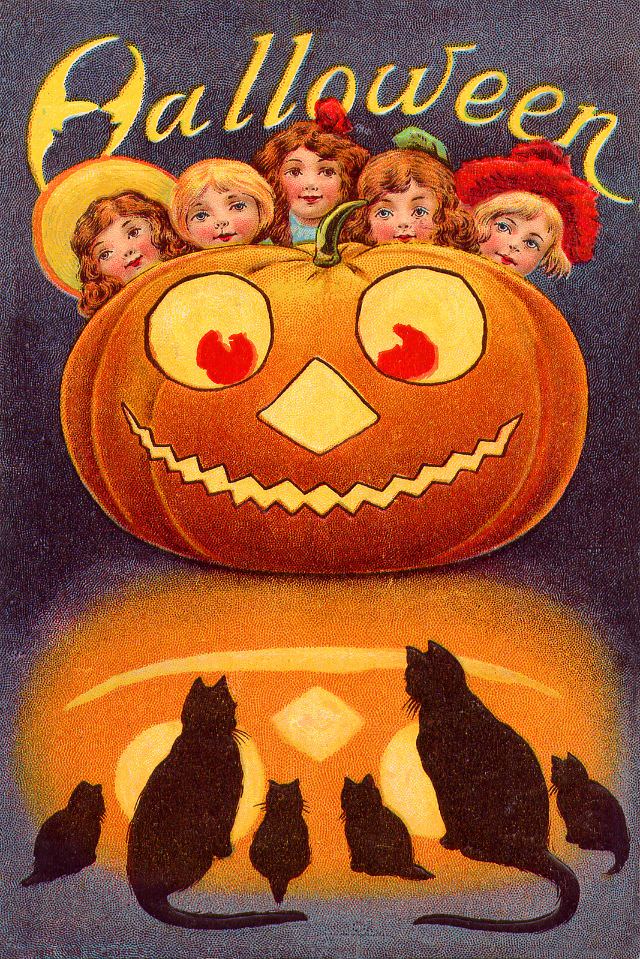
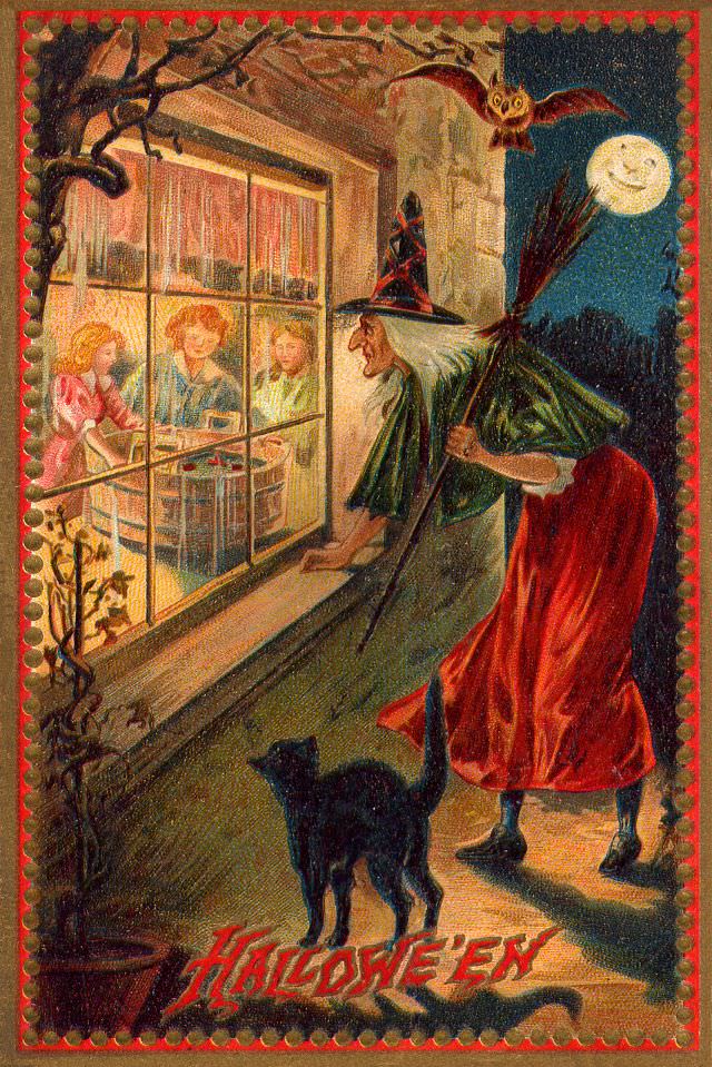
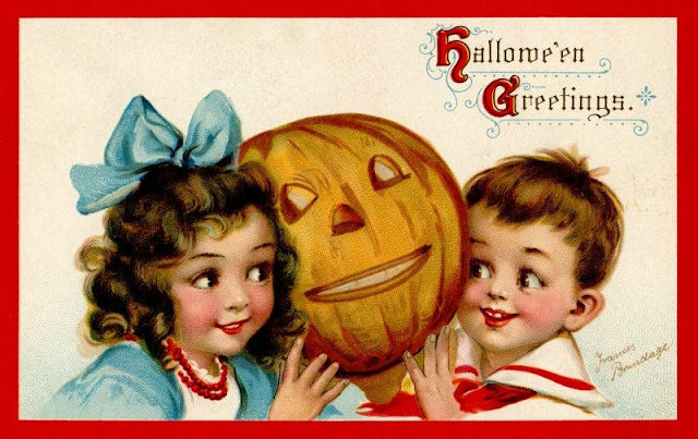
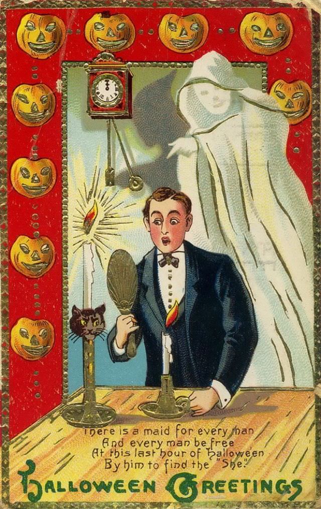
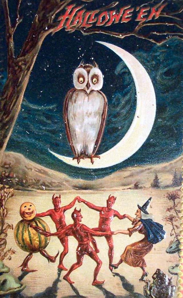
The spelling “Hallowe’en” — with an apostrophe — appears on many cards from this period. This older form of the word was still standard in the early 1900s, and seeing it printed across so many designs is a small but telling historical detail. It marks exactly when these cards were made.
Superstition played a big role in Halloween at this time, and the postcards captured that spirit. Fortune-telling scenes were popular — mirrors, candles, and apple peels were all part of old Halloween rituals used to predict the future. Cards featuring these moments gave recipients a sense of mystery tied to real folk practices still alive in many communities.
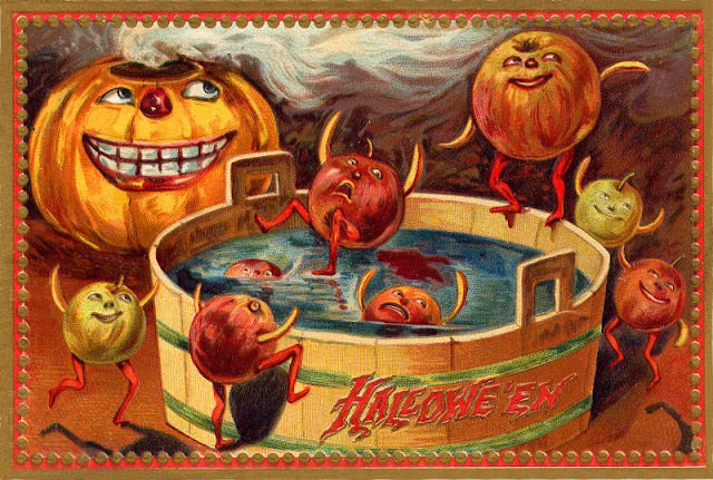
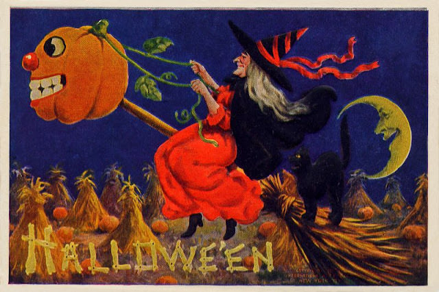
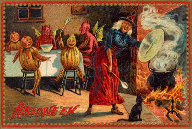
The artistry on these cards was genuinely impressive. Lithographic printing techniques of the era allowed for rich, saturated colors — deep oranges, velvety blacks, and bright yellows. Artists used fine linework and detailed backgrounds to create scenes that felt fully realized, even on a small card meant to travel through the mail.
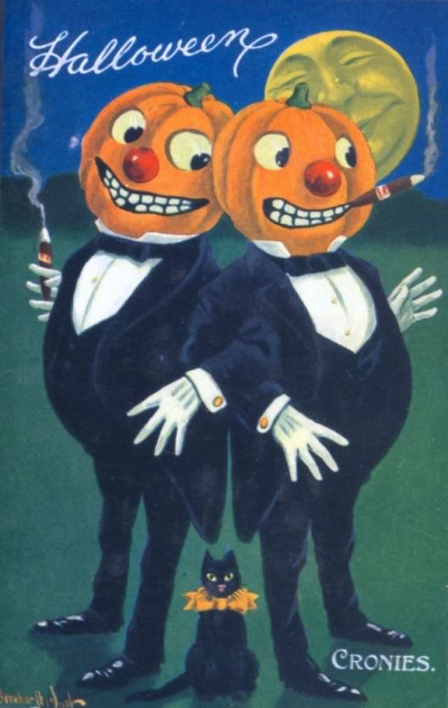
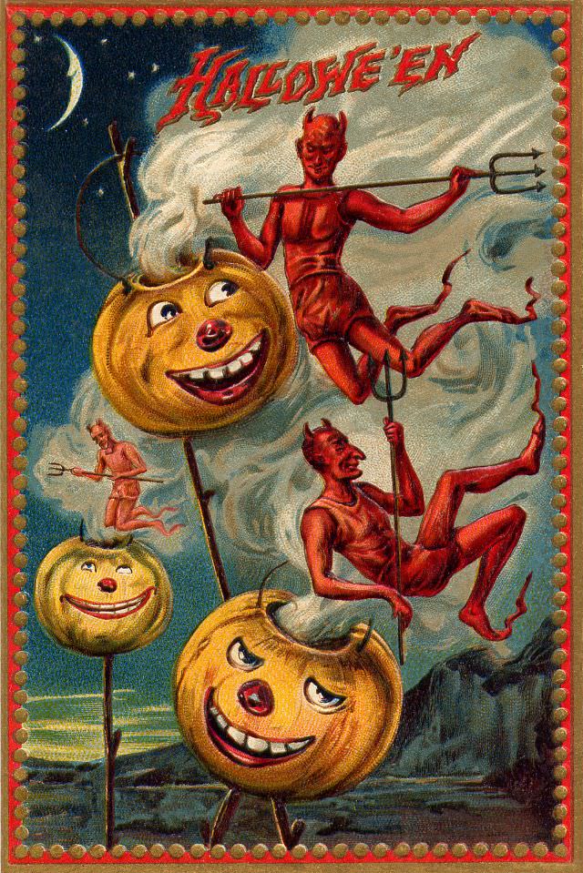
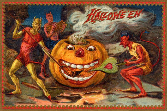
Devils and imps appeared on some cards alongside the more familiar witches and ghosts. These figures connected Halloween to older European traditions that tied the holiday to supernatural forces. Their inclusion alongside cheerful greetings shows how early 20th-century Americans blended the ancient and the modern in how they observed October 31st.
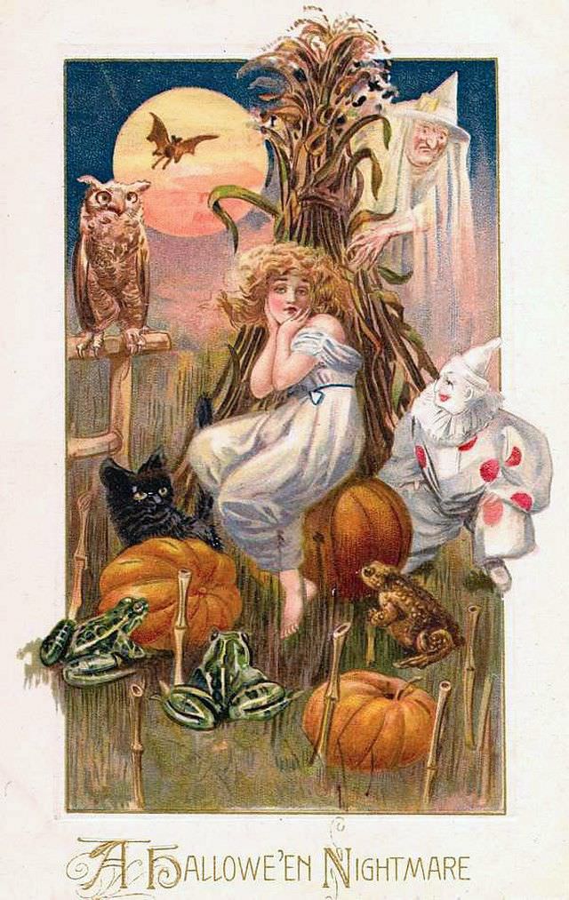
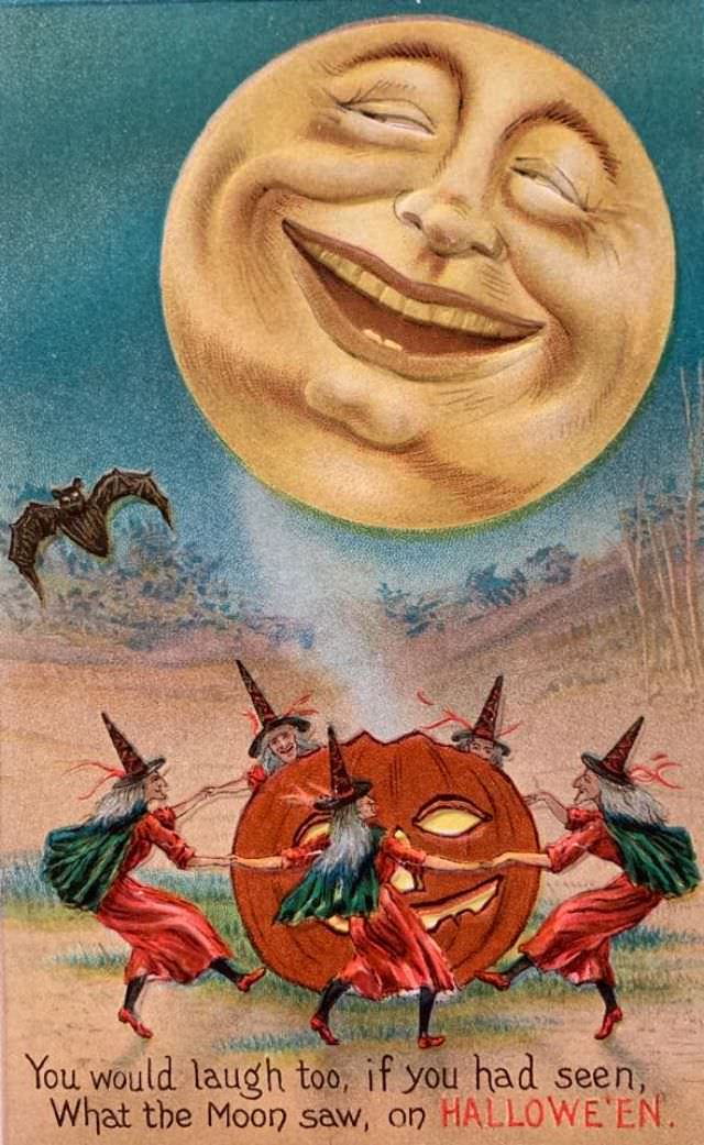
The moon was a constant presence in Halloween postcard art. Full moons lit nearly every scene — casting long shadows behind witches, silhouetting owls on branches, and glowing behind carved pumpkins. The moon served as both a visual anchor and a symbol of the night’s mysterious power.
Sending Halloween postcards was a genuine social ritual. Friends, family members, and even acquaintances exchanged them in the weeks leading up to October 31st. The practice helped Halloween feel like a proper holiday season, much the way Christmas cards gave December its own shared culture of greeting and connection.
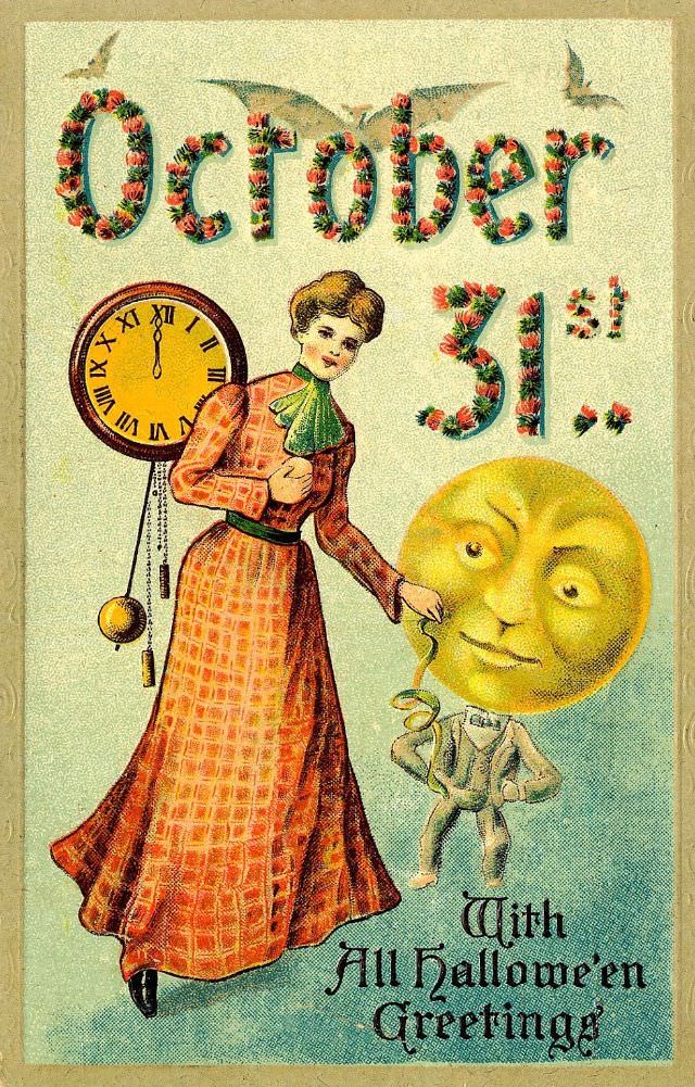
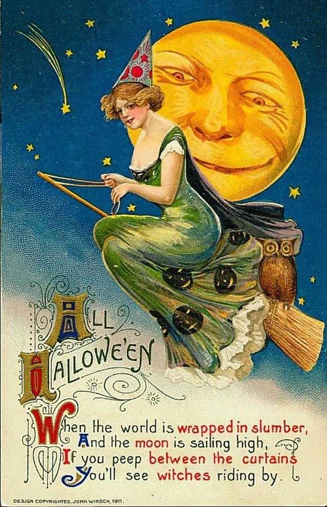
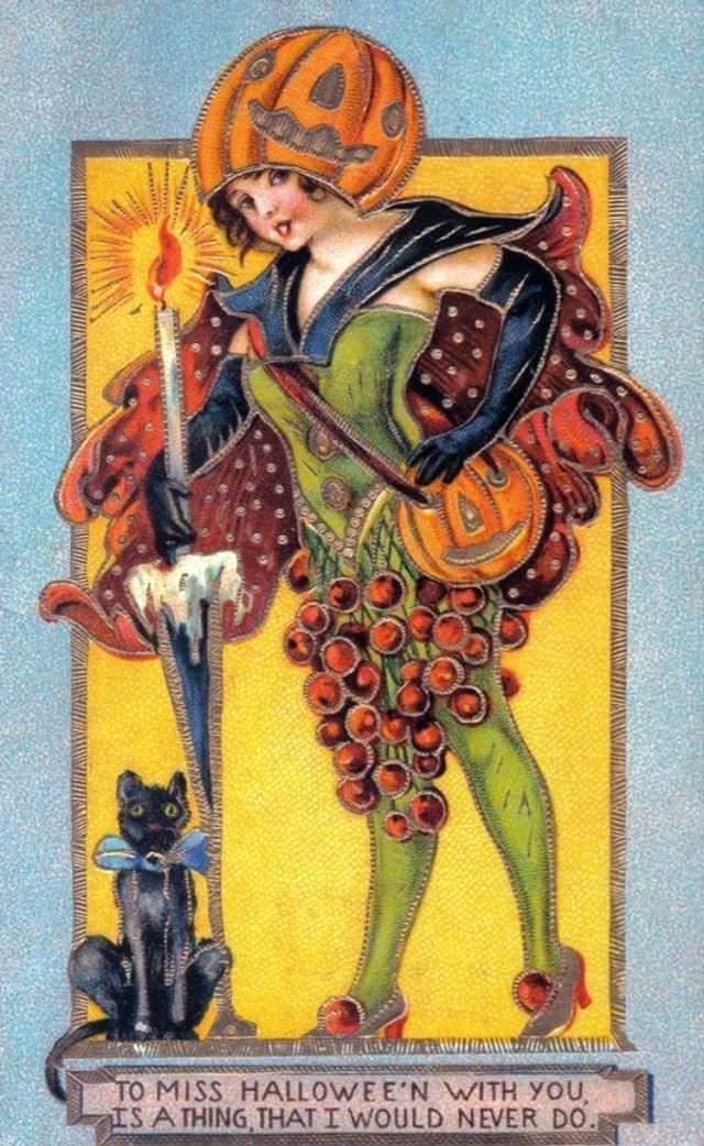
Witches on these cards were often portrayed as attractive young women rather than haggard old crones. This was a deliberate artistic choice that made the imagery more appealing and less threatening. The witch as a fashionable, even glamorous figure was a recurring theme that spoke to the playful, romantic tone publishers aimed for.
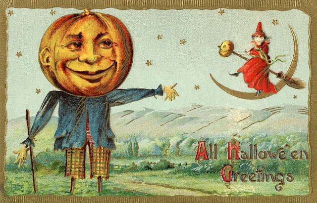
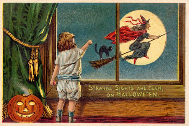
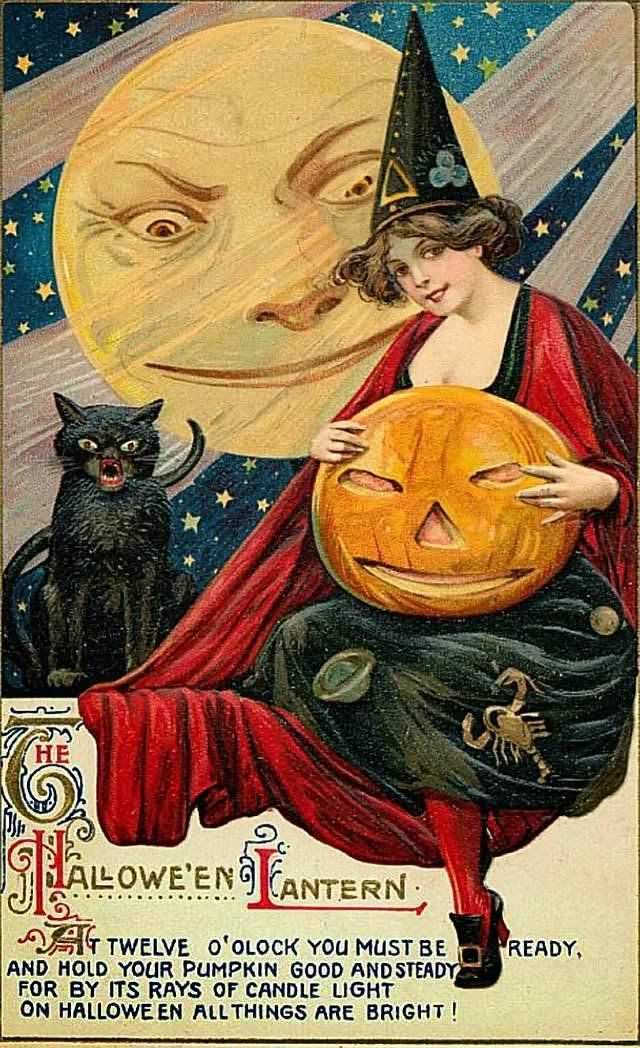
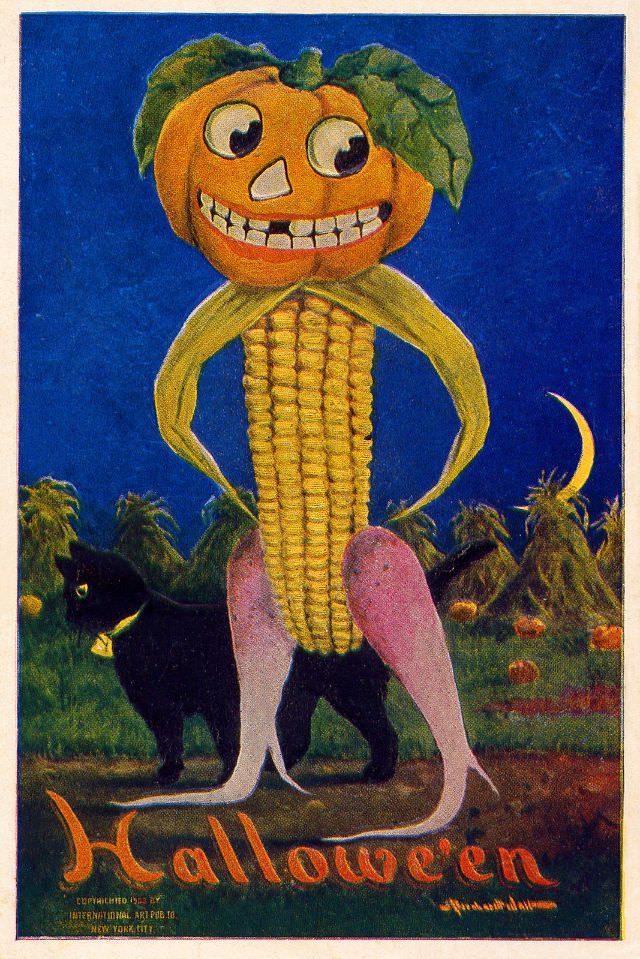
The jack-o’-lantern appeared in nearly every card series published during this era. Carved pumpkin faces — grinning, grimacing, or wide-eyed — were the defining image of the holiday. Some cards showed children carrying them through dark streets. Others placed giant pumpkins at the center of surreal, fantasy scenes where lanterns came to life.
Today, these postcards are prized collectibles. Antique dealers and Halloween enthusiasts hunt for them at estate sales, auctions, and online markets. Original cards in good condition — especially those from well-known publishers — sell for significant sums. They survive as small, vivid artifacts of a moment when Halloween was still finding its shape as an American holiday.