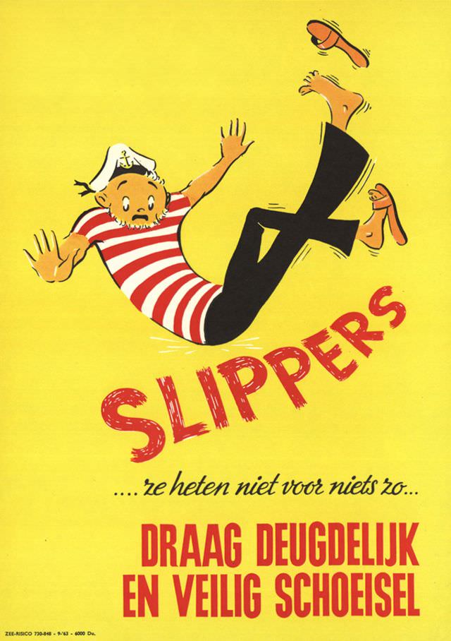
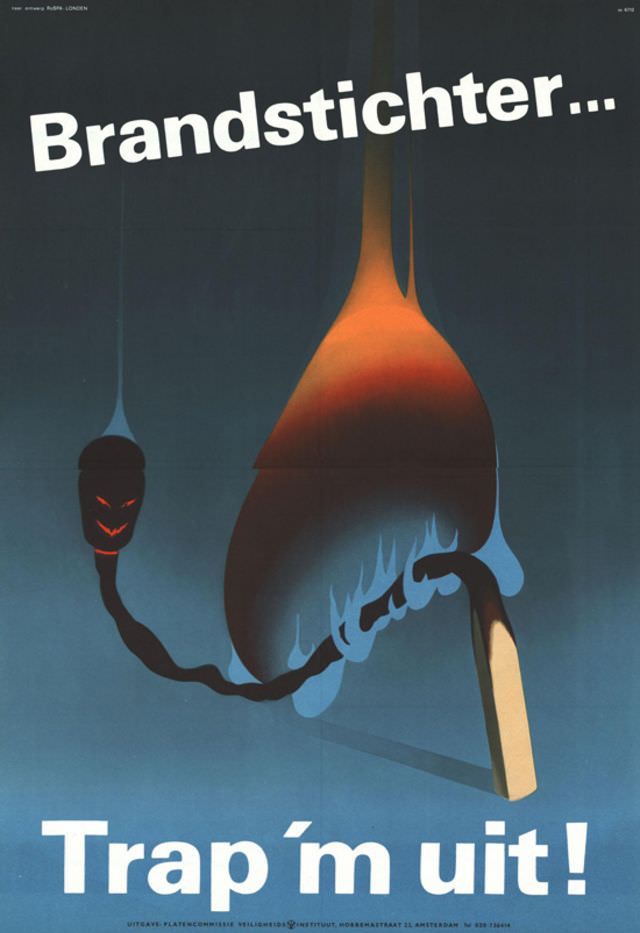
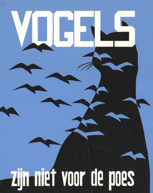
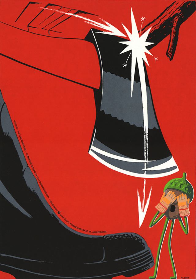
Between the 1920s and 1960s, Dutch artists produced some of the most striking workplace safety posters ever made. Commissioned to reduce accidents in factories, construction sites, and industrial settings, these posters did not shy away from showing exactly what could go wrong. Severed fingers, crushed limbs, and workers struck down by heavy machinery were common subjects. The goal was simple: shock workers into paying attention.
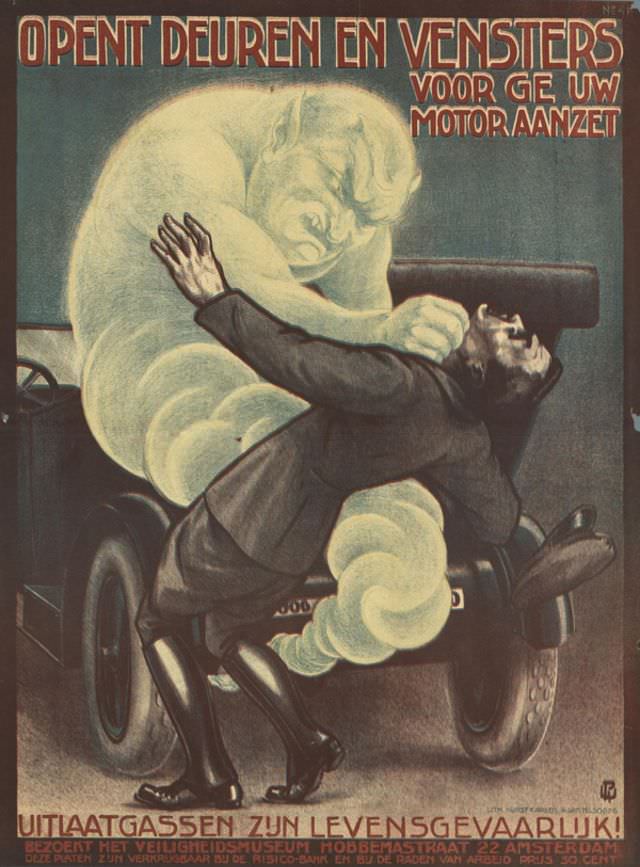
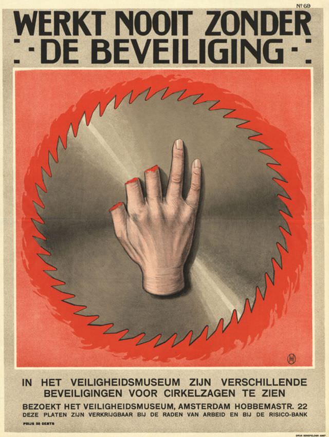
The earliest posters from the mid-1920s set the tone for everything that followed. Artists like Jacob Jansma and Willem Papenhuyzen used flat, graphic illustration styles that were common in commercial art at the time. Bold outlines, limited color palettes, and direct visual messages made these posters easy to read at a glance — which mattered in a loud, busy factory floor.
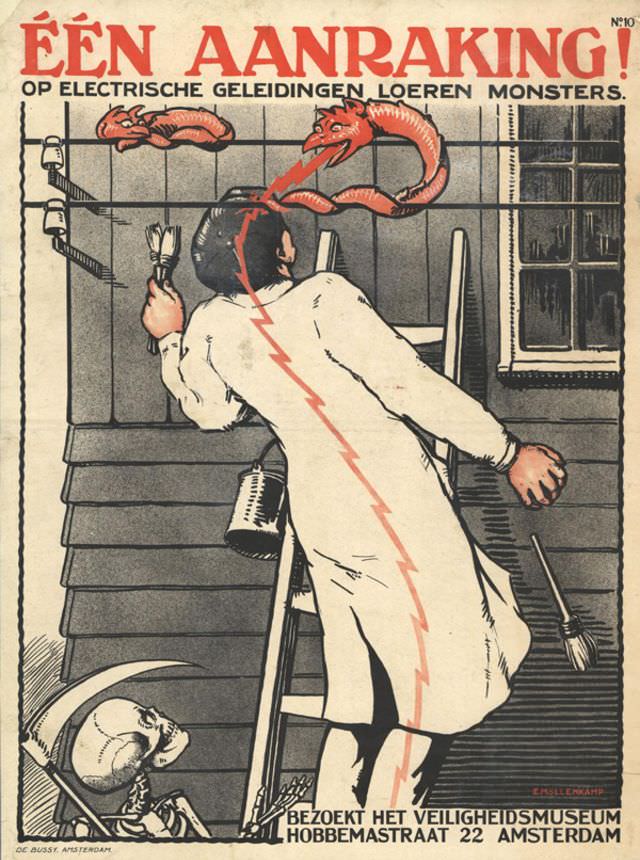
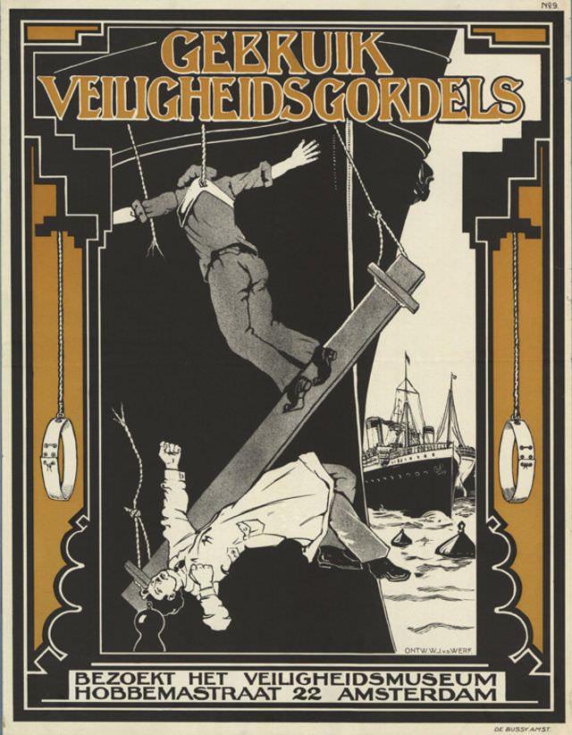
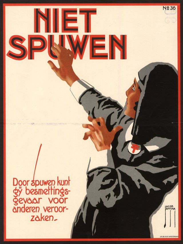
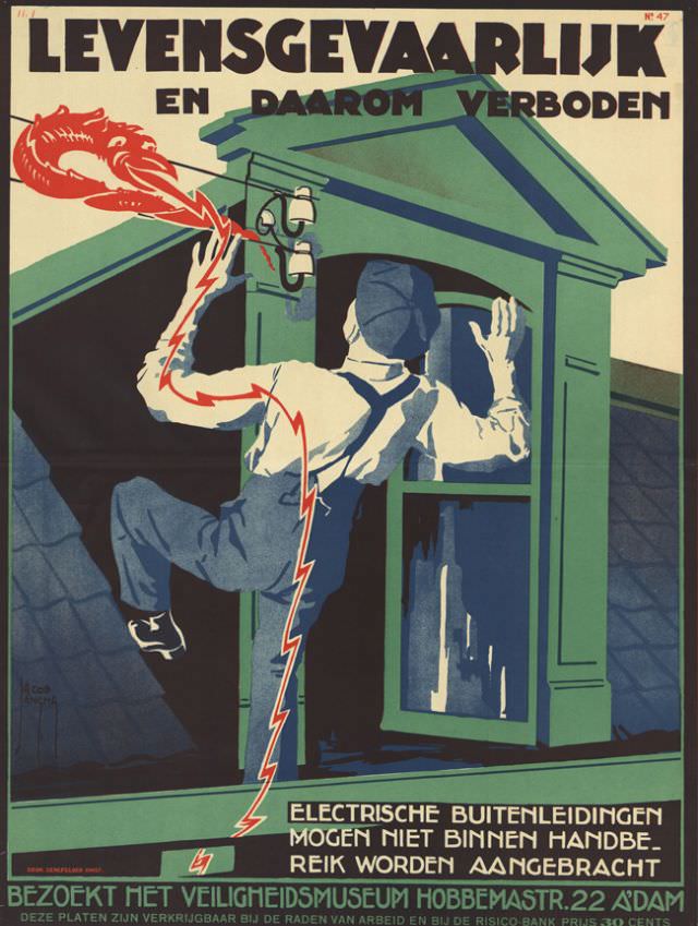
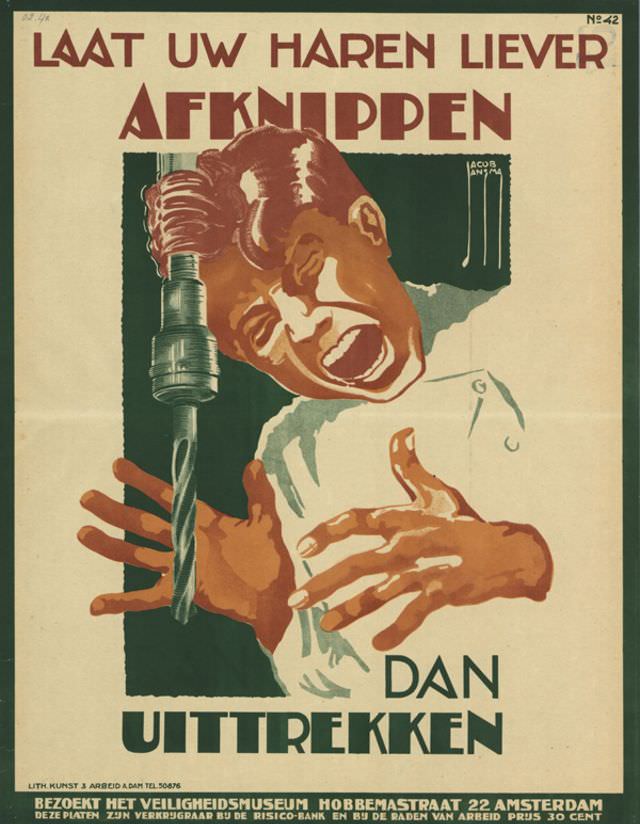
Jacob Jansma alone produced multiple posters in 1925, each targeting a different type of workplace hazard. O. Roland contributed a poster that same year, and by 1926 Albert Hahn had joined the effort. Hahn was already well known as a political cartoonist, and he brought that same sharp, expressive style to safety messaging.
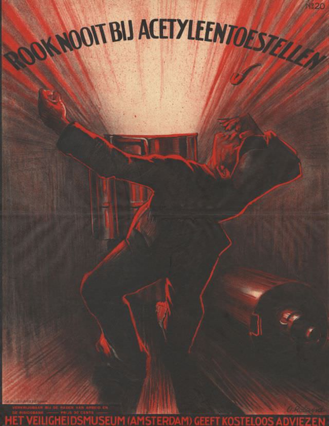
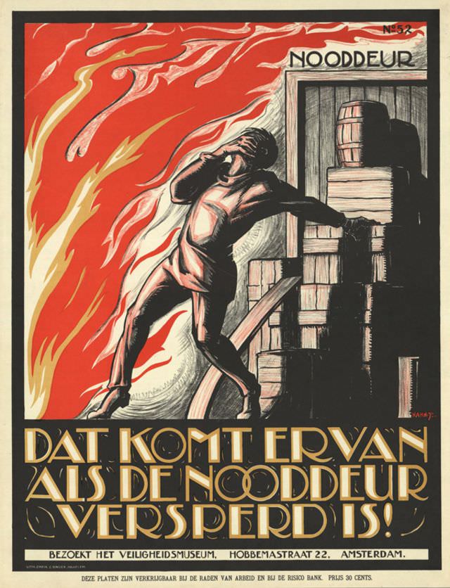
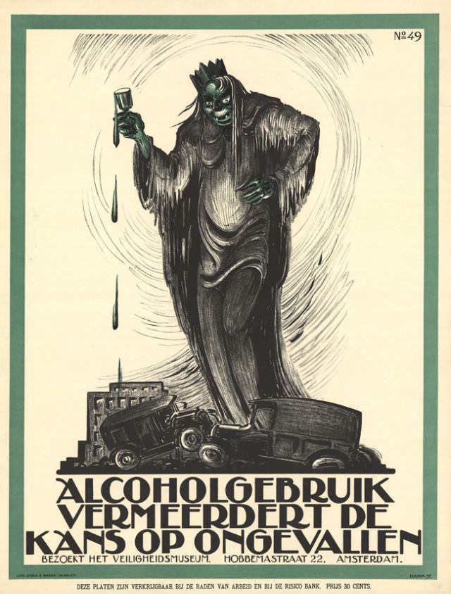
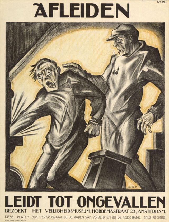
Herman Heyenbrock added his work to the series in 1928. His poster reflects the detailed, realistic style he was known for in industrial and maritime painting. By the late 1920s, the campaign had established a clear visual language: danger was shown directly, consequences were made explicit, and workers were depicted as vulnerable to the machines around them.
A decade later, a new wave of artists picked up where the first generation left off. The 1939 posters — produced by E. Lukács, Gé Hurkmans, Strelitskie, and W. Poll — show a shift toward slightly more modern design. Compositions became bolder and more dramatic, leaning into the visual tension between a worker’s body and the industrial environment threatening to harm it.
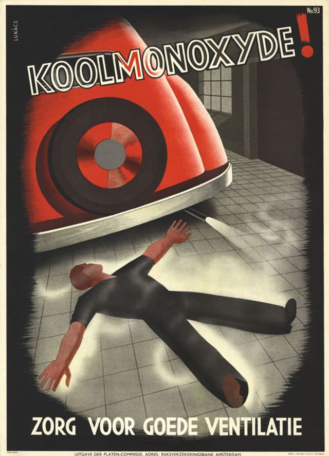
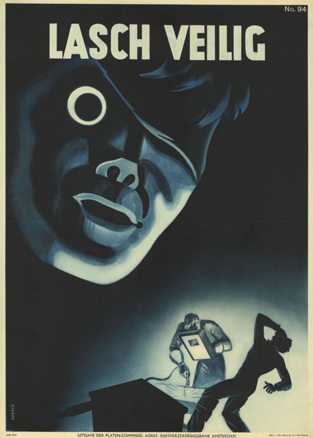
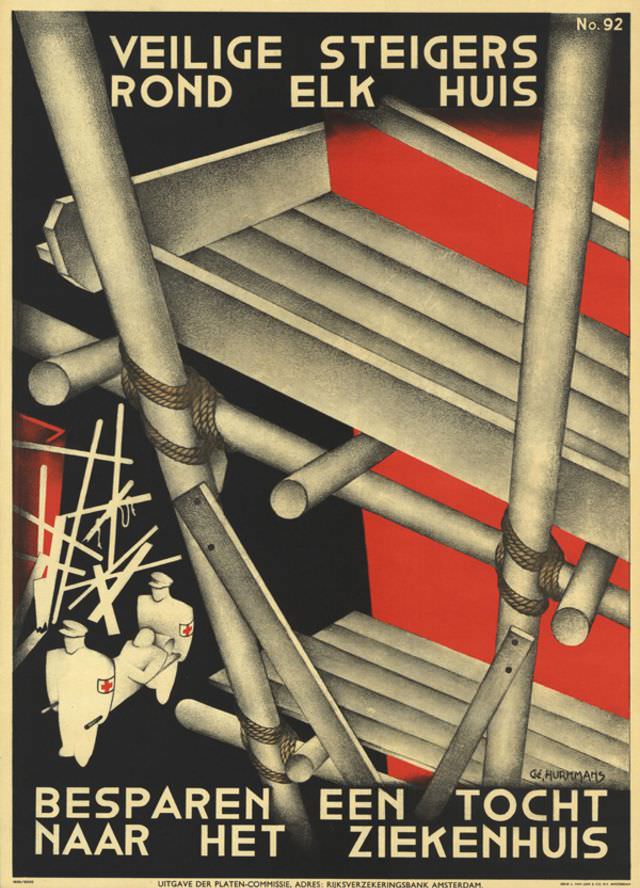
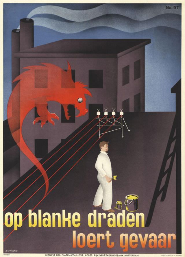
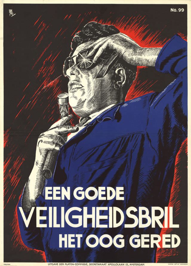
Production continued through the early 1940s, even as the Netherlands was occupied by Nazi Germany. Posters by Dirk de Leeuw, E. Lukács, Jacob Jansma, and Strelitskie appeared in 1940 and 1941. The fact that safety campaigns persisted during wartime occupation speaks to how embedded industrial injury prevention had become in Dutch working life.
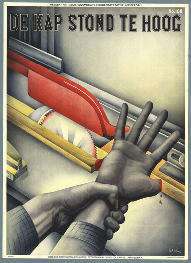
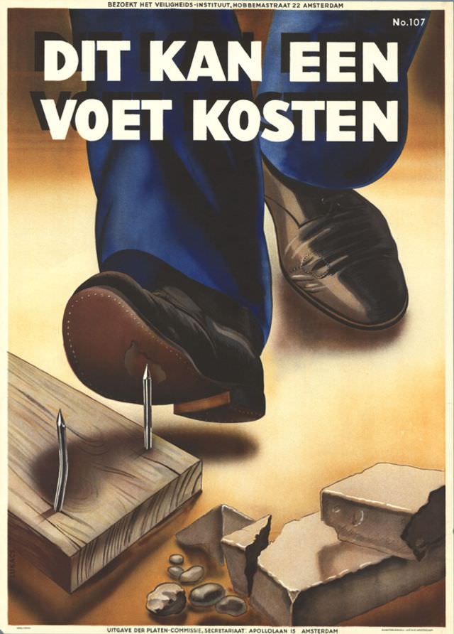
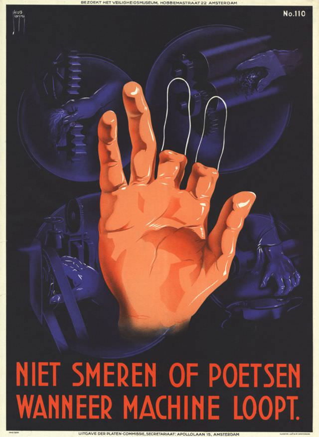
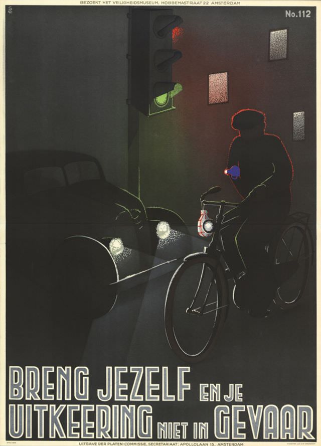
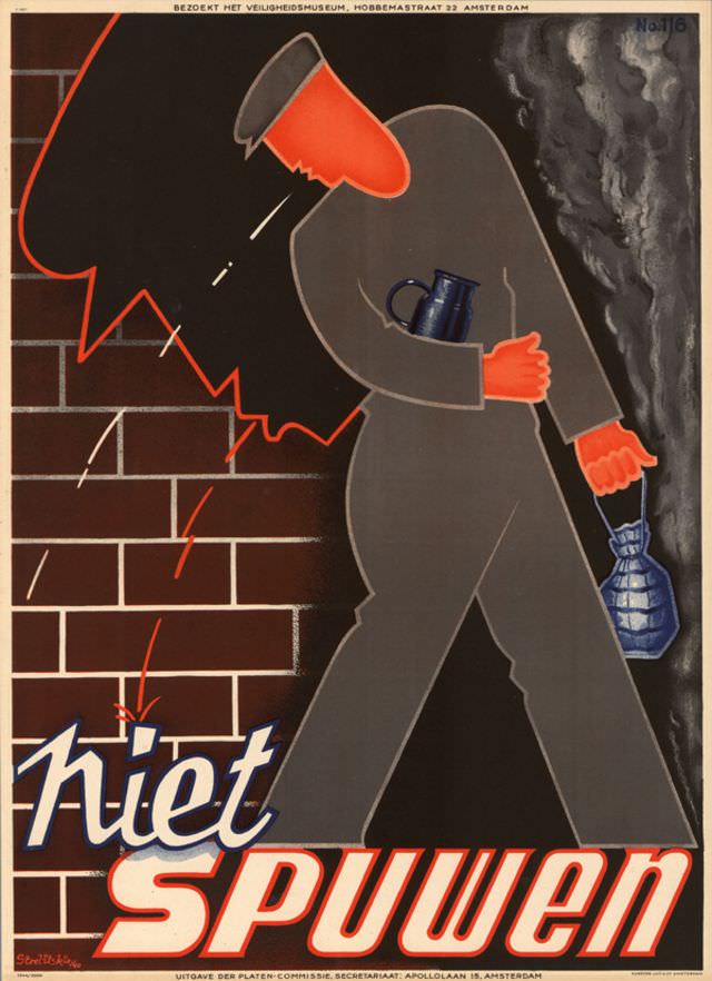
Hans Bolleman produced two posters in 1942, and an unknown designer contributed one in 1944. After liberation in 1945, Renes and Jan Rot collaborated on a poster, and another anonymous designer added a second. These postwar works mark a transition point in the series — the country was rebuilding, industries were restarting, and the dangers of factory work hadn’t gone away.
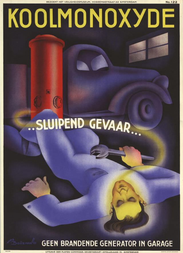
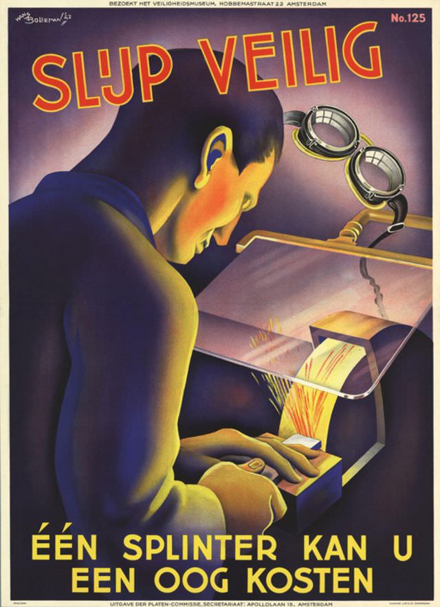
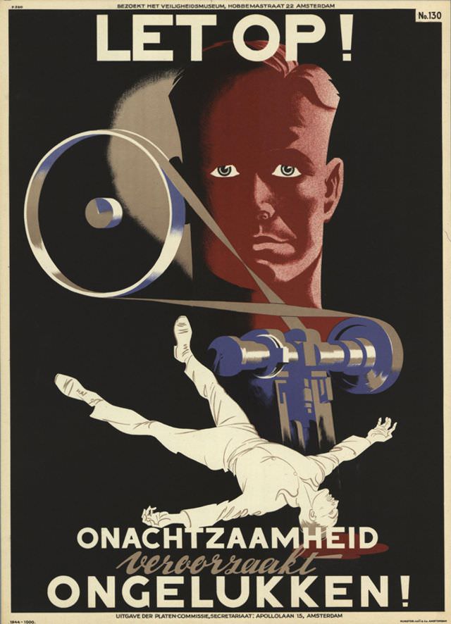
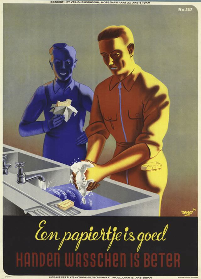
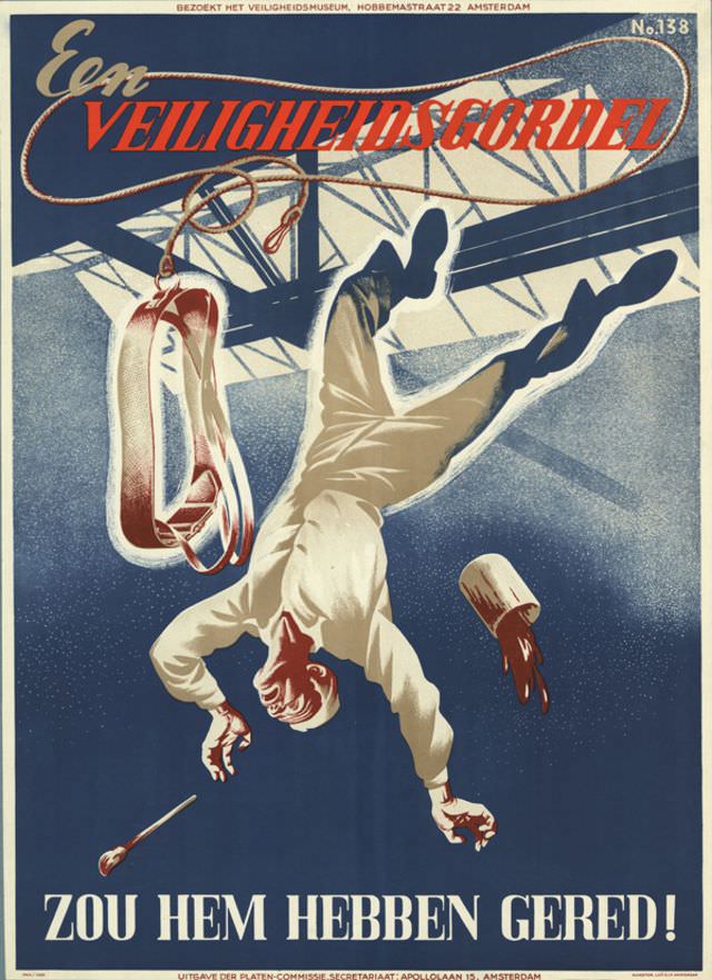
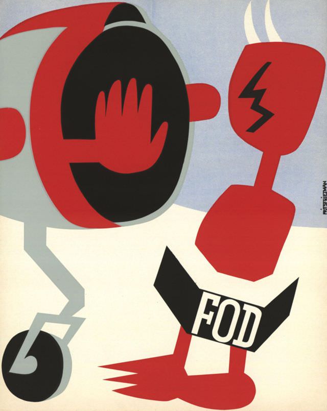
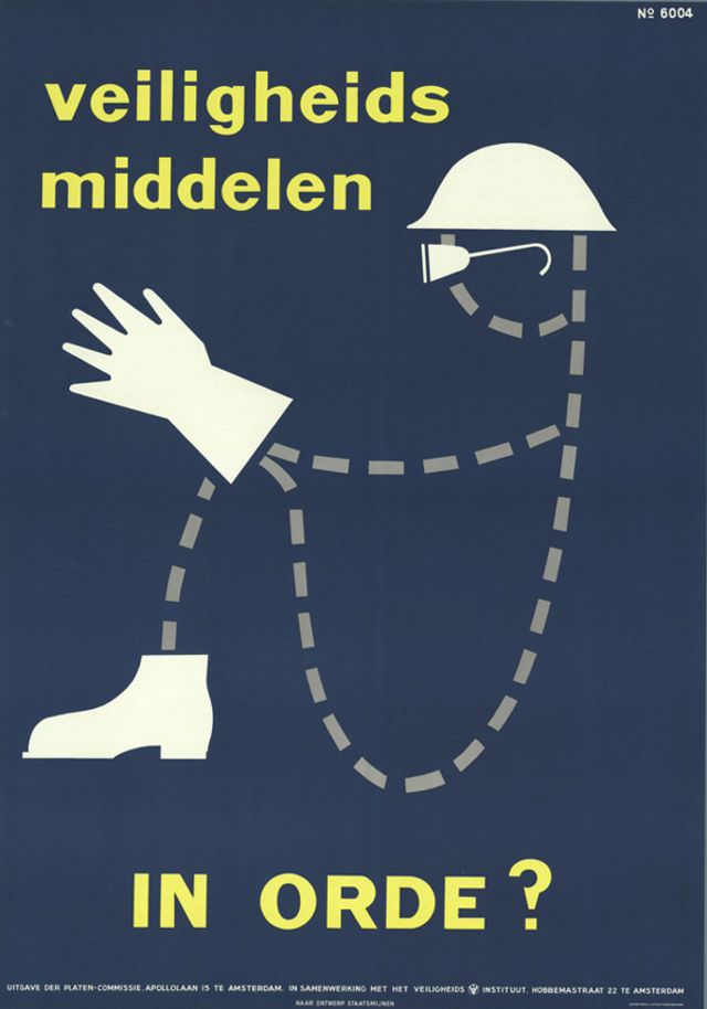
The 1950s brought a new crop of artists and a somewhat cleaner aesthetic. Designers like N. Olthuis, Dick Harders, R. Wormer, and Jack de Rijk produced work that leaned into mid-century modernism — simpler shapes, flatter color fields, and a more graphic approach to depicting injury. The horror was still there, but it was delivered with more visual economy.
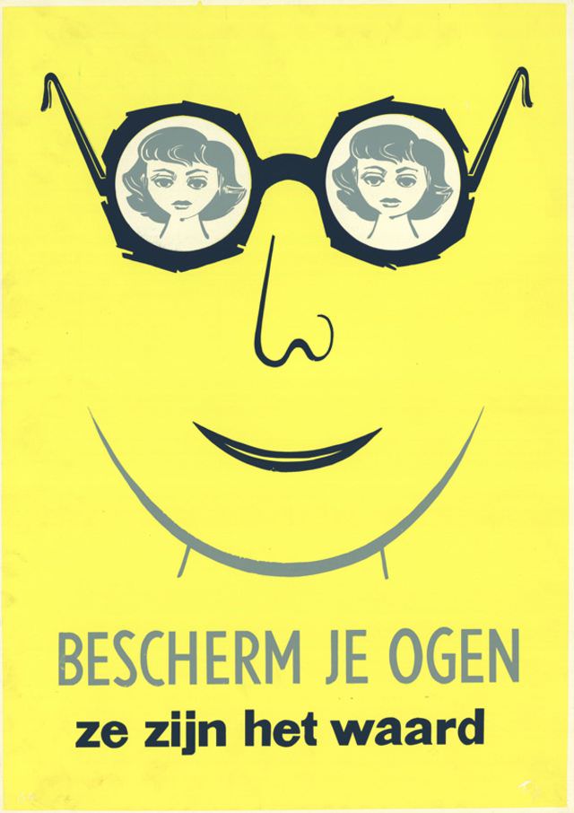
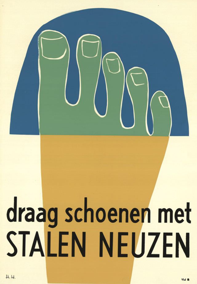
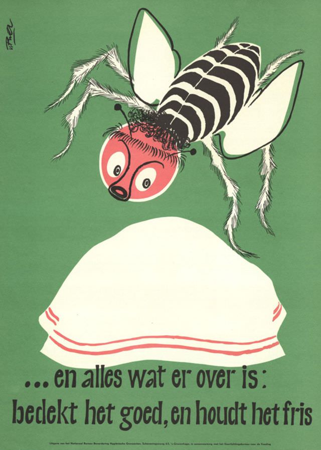
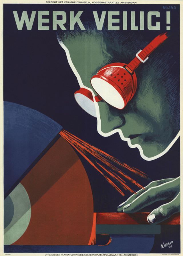
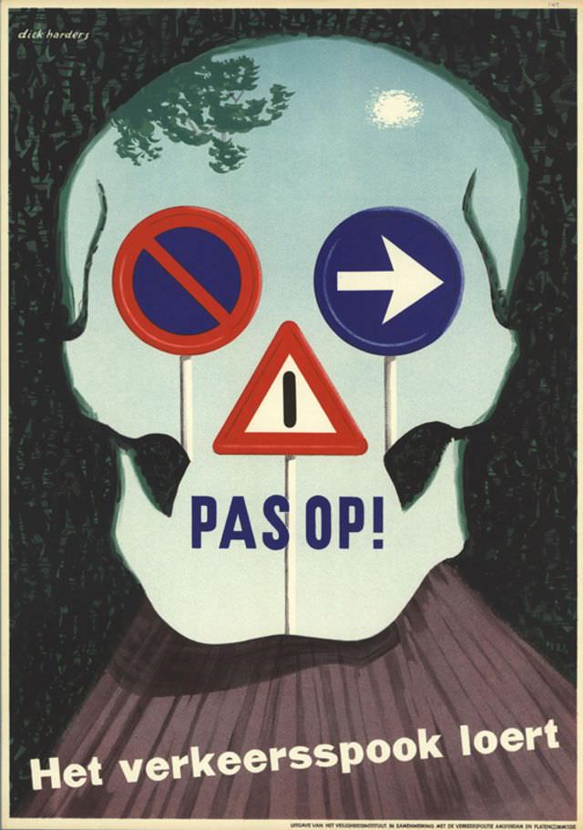
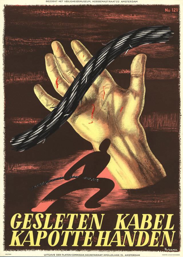
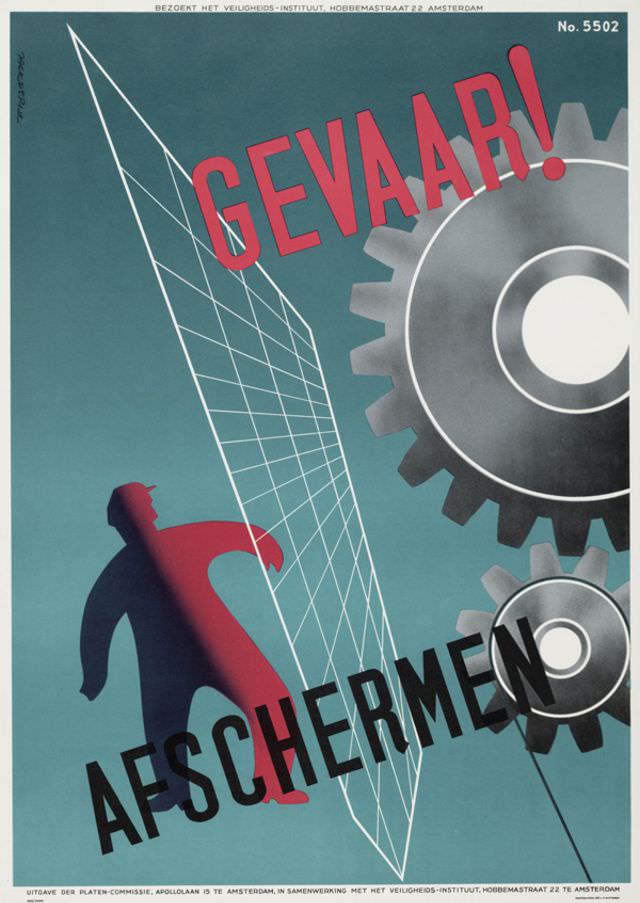
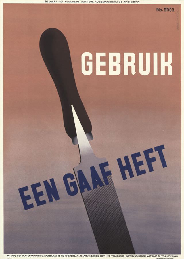
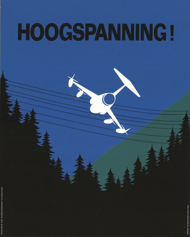
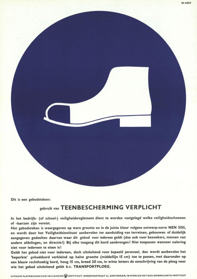
Ary Halsema contributed a poster in 1958, and by 1959 the series was in full swing again with work by T.T. Kwee alongside several anonymous designers. The late 1950s and early 1960s produced a large cluster of posters — many by unknown designers — that targeted specific risks: falling objects, unguarded machinery, electrical hazards, and unsafe scaffolding.
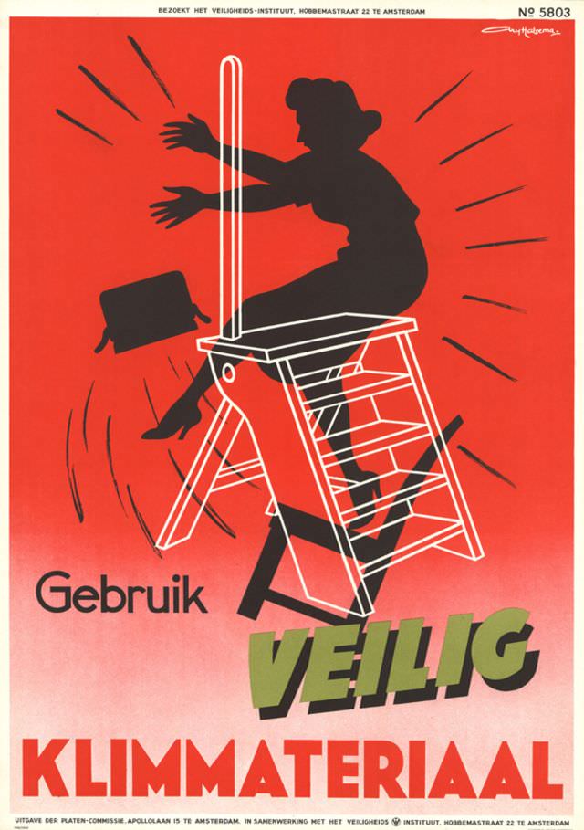
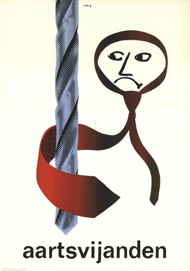
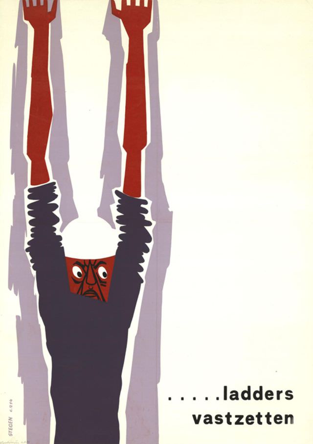
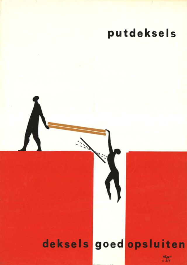
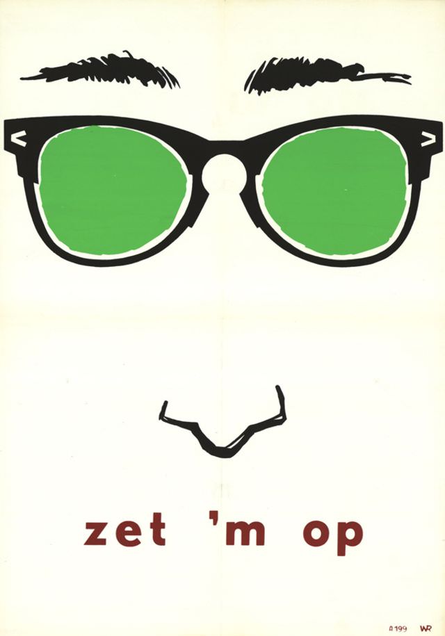
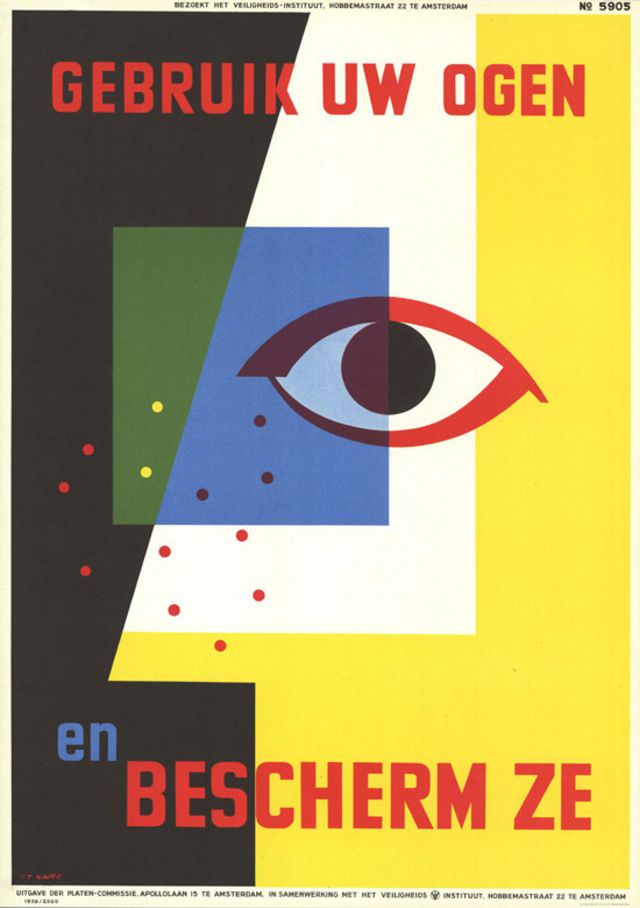
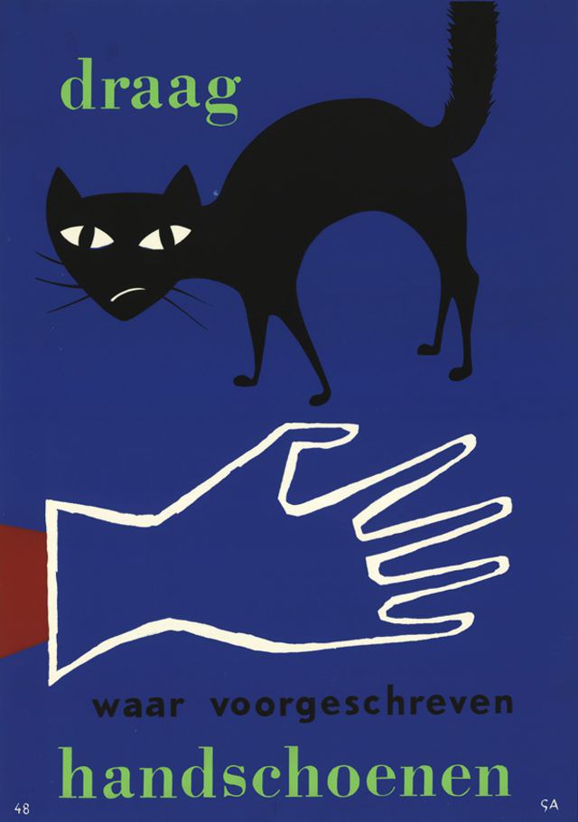
The final posters in this collection date from the early-to-mid 1960s, with a handful reaching into 1967 and 1968. Artists Frits Frietman and T. ten Geusendam both produced work around 1960. Several posters from this final period have no confirmed designer — their creators anonymous, their imagery still vivid. Across four decades, these posters remained consistent in one key way: they never softened the message.