After the Bolshevik Revolution of 1917 and the brutal civil war that followed, the new Soviet government needed tools to shape public opinion fast. Cinema rose to the top of that list. Vladimir Lenin himself called it “the most significant of all arts,” and the state wasted no time putting it to work. Film was cheap to distribute, required no literacy, and could reach enormous crowds — a perfect vehicle for spreading revolutionary ideas across a vast, multilingual country.
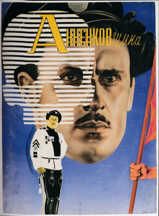
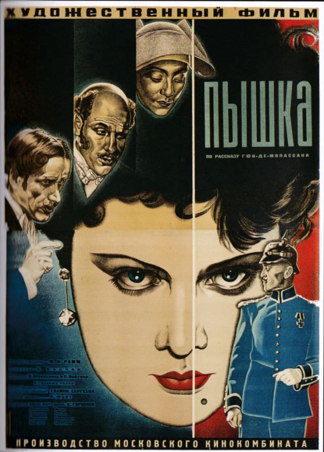
But getting people into theaters required something eye-catching. A group of young, bold artists answered that challenge by designing posters unlike anything the world had seen before. They plastered city streets with vivid colors, sharp angles, dramatic typography, and images that demanded attention. These weren’t gentle advertisements. They were visual shocks designed to stop people mid-stride.
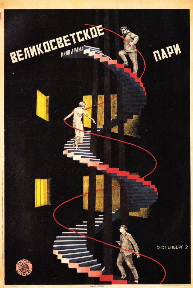
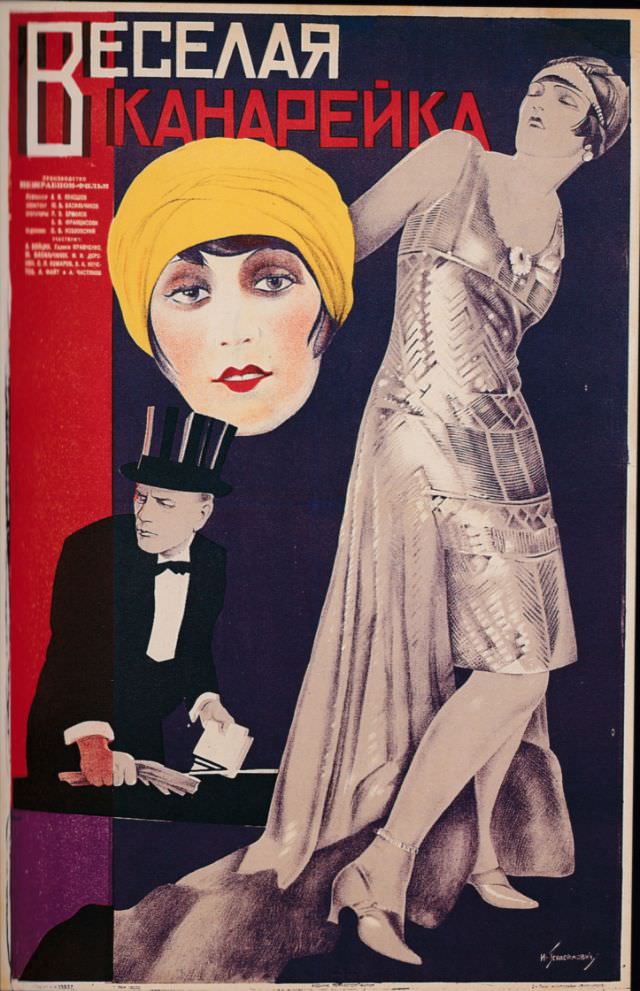
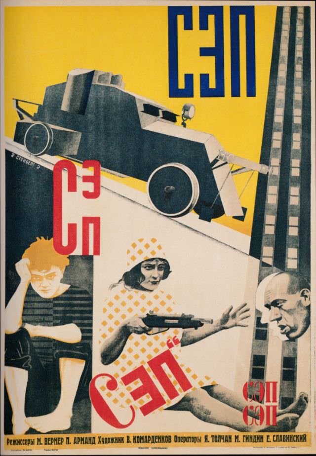
The style these artists developed drew from Constructivism — a movement that rejected decorative art in favor of designs built around function and bold geometric form. Red, black, and white dominated many compositions. Diagonal lines created energy and motion. Human figures were cropped, fragmented, or blown up to monumental scale. The goal was emotional impact, and these posters delivered it.
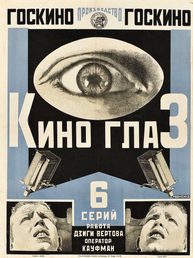
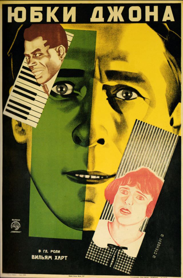
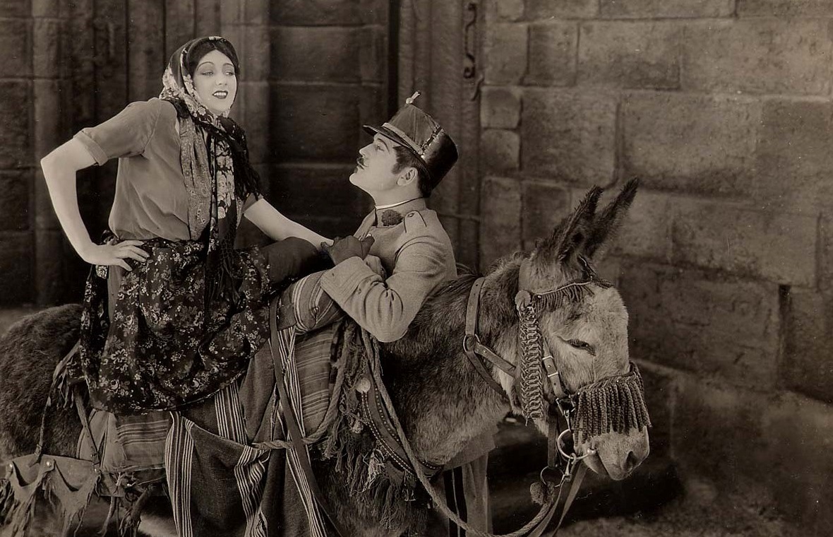
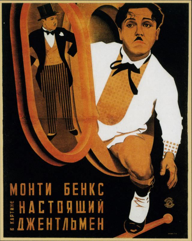
Soviet studios didn’t only screen homegrown films. Foreign productions from Germany, the United States, and elsewhere also played in Soviet theaters, and those films received the same explosive poster treatment. American comedies, German city symphonies, and Georgian dramas all got repackaged in the distinctive Soviet graphic style — often making the posters far more striking than the films themselves.
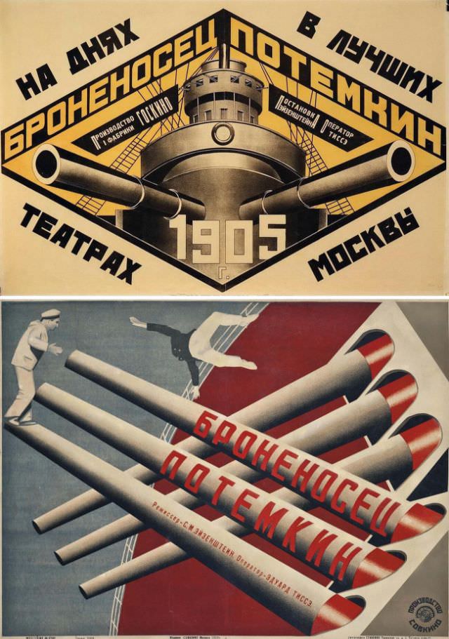
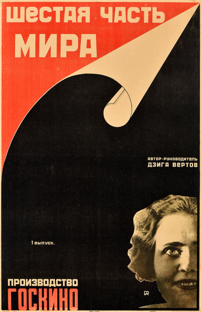
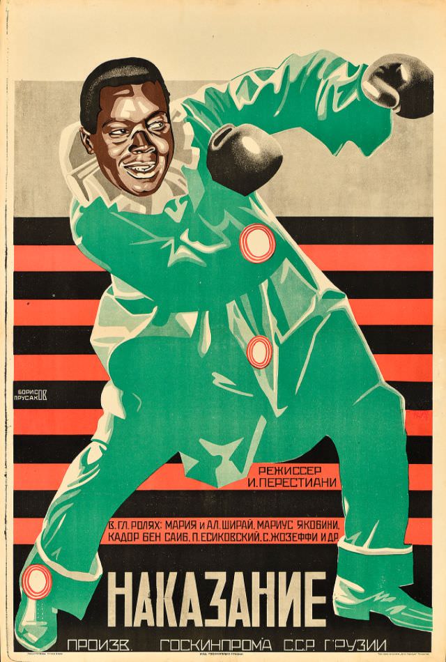
By the mid-1920s, the output was extraordinary. Dziga Vertov’s documentary films about Soviet life and industry received posters that matched their kinetic energy. Sergei Eisenstein’s Battleship Potemkin — already a landmark in filmmaking — was paired with equally powerful graphic design. Each poster functioned almost as a second artwork layered on top of the first.
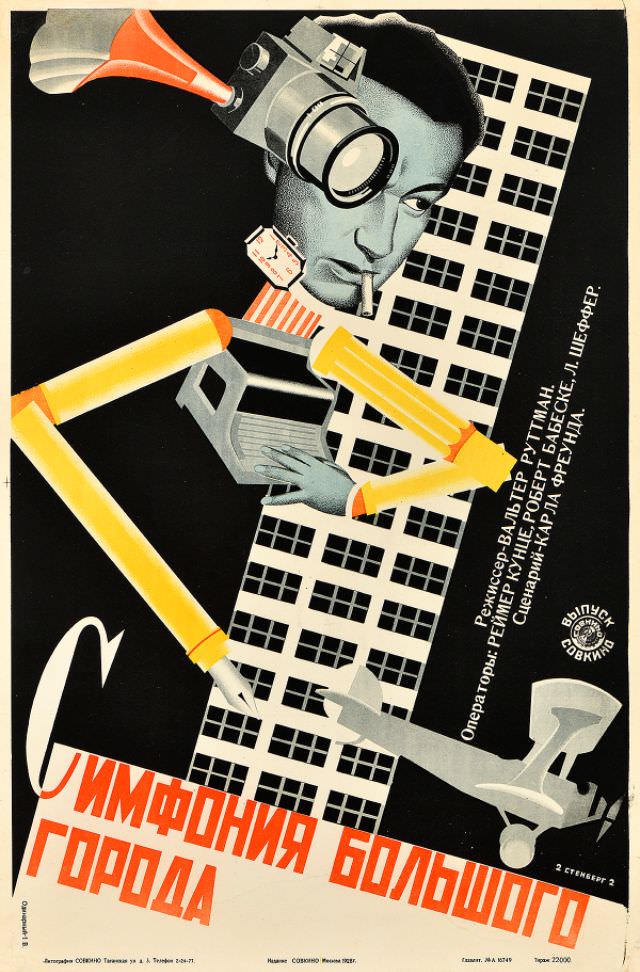
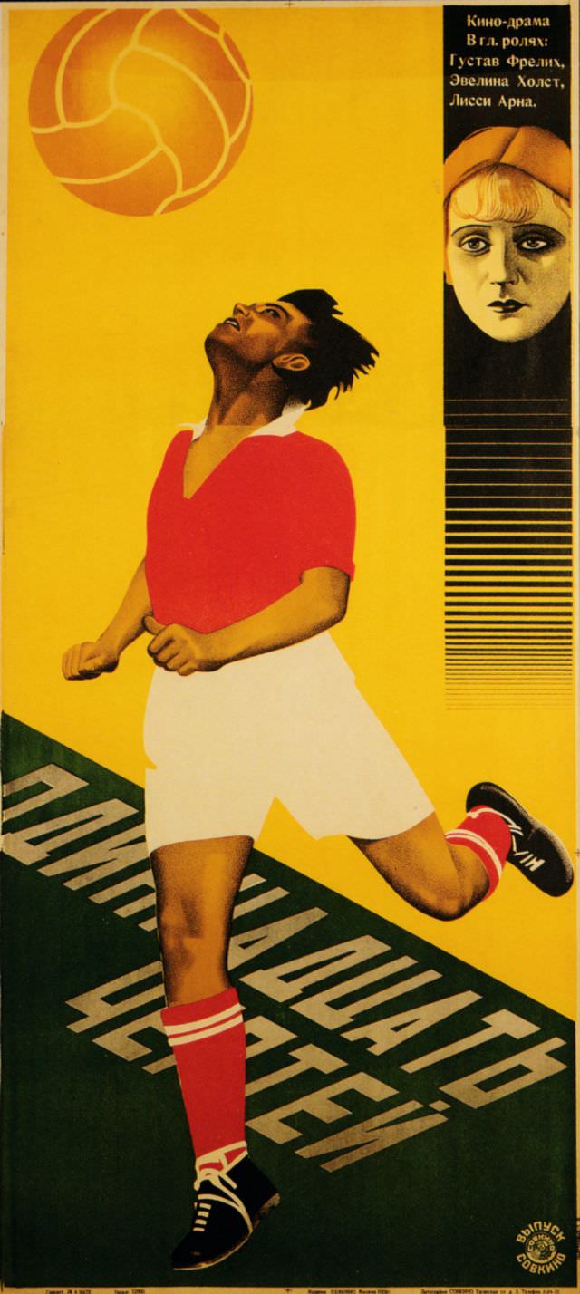
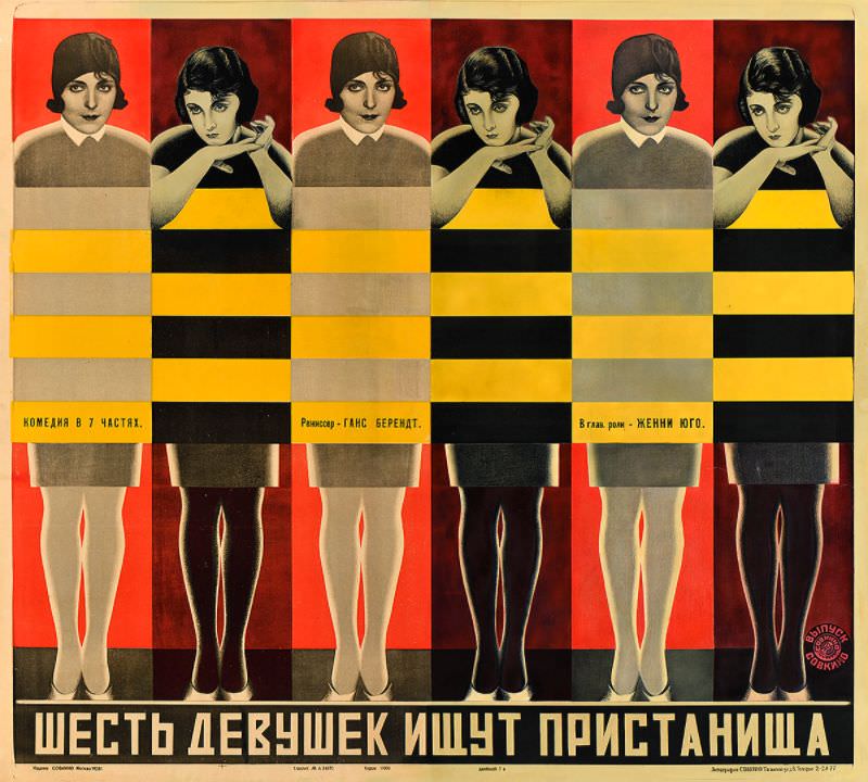
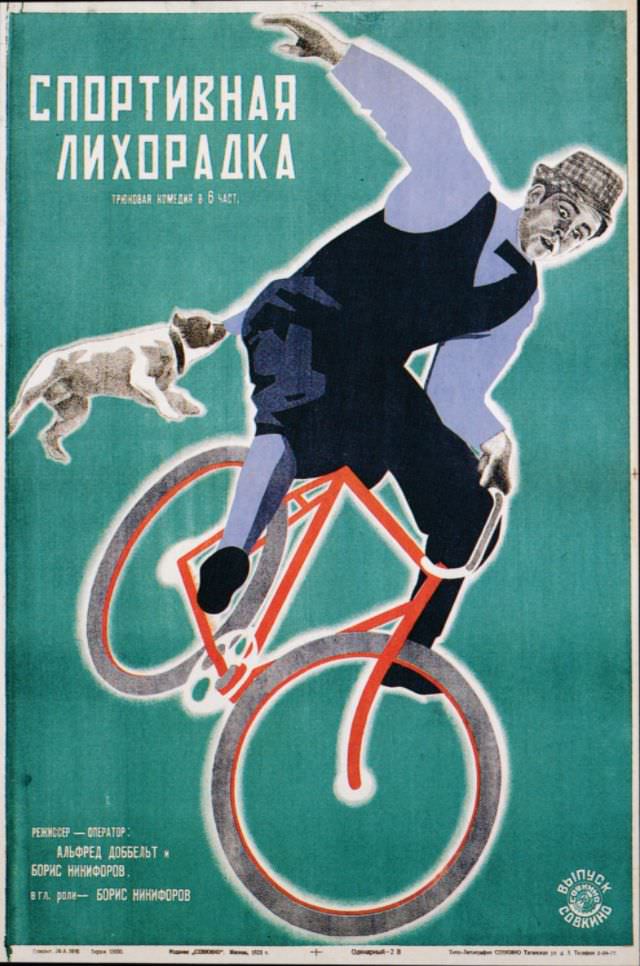
The year 1927 saw a particularly rich burst of poster production. Sports films, foreign imports, and Soviet social dramas all received distinct, inventive treatments. Artists like the Stenberg brothers — Vladimir and Georgii — became known for their ability to twist perspective, enlarge partial figures, and create depth on a flat surface. Their work alone accounts for hundreds of posters from this era.
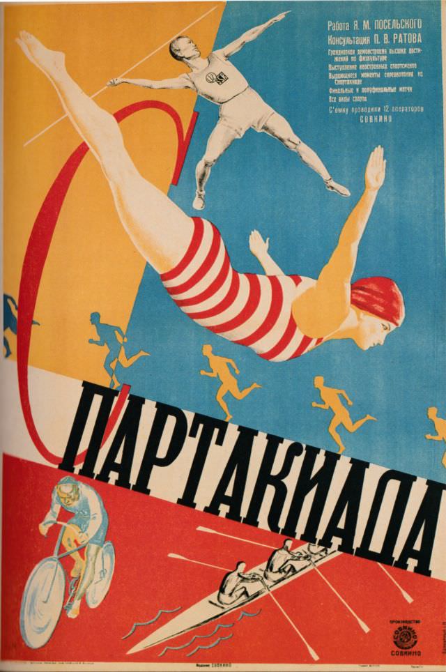
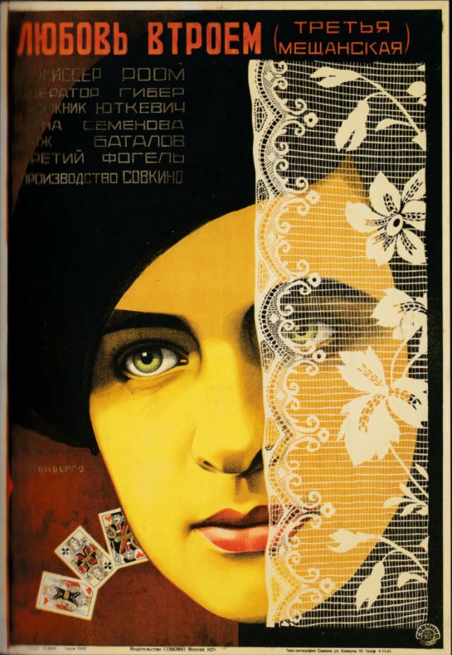
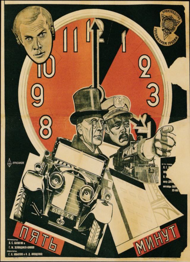
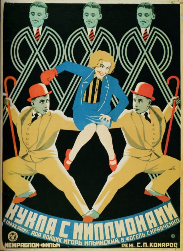
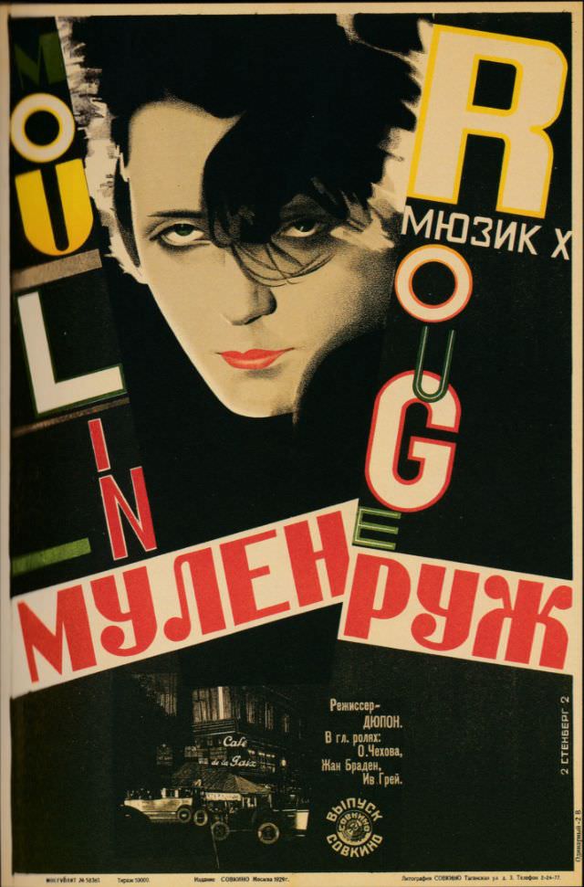
By 1928, the designs had grown even more experimental. Photomontage — cutting and combining photographs — appeared alongside hand-drawn illustration. Faces were rendered in two or three flat colors. Lettering became part of the composition rather than an afterthought. The posters for films like The Doll with Millions and Moulin Rouge show how effortlessly these artists absorbed outside influences and pushed them in new directions.
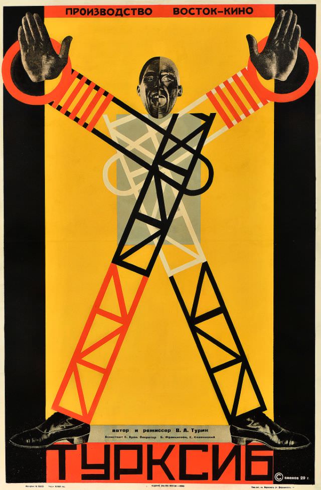
The year 1929 marked the peak of this creative period. Documentary filmmakers like Dziga Vertov and Mikhail Kaufman were producing some of their most ambitious work, and the posters kept pace. Turksib, a documentary about the construction of the Turkestan–Siberian Railway, received a poster as monumental and forward-charging as the project it depicted.
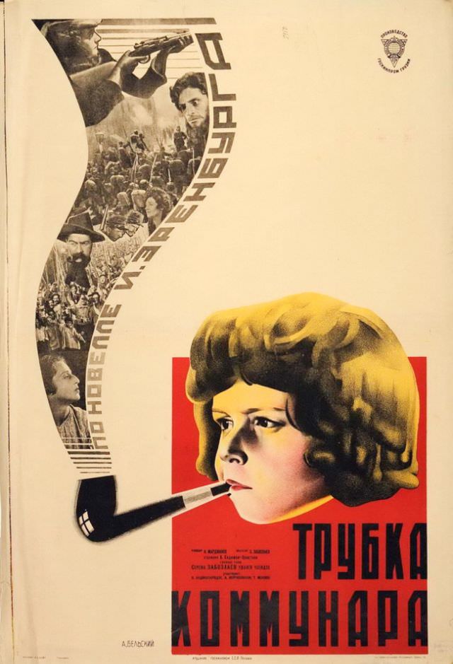
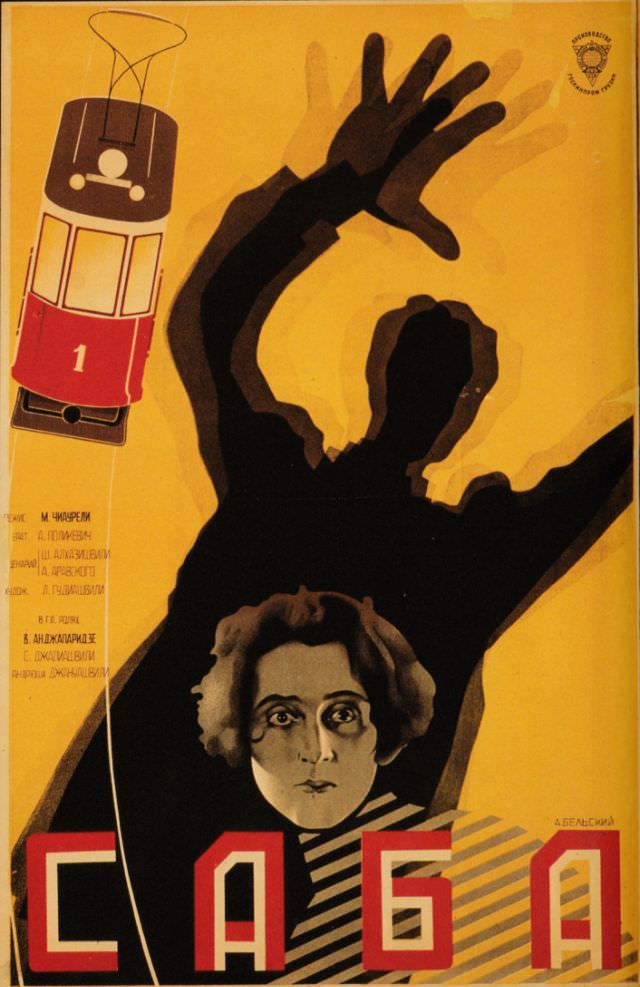
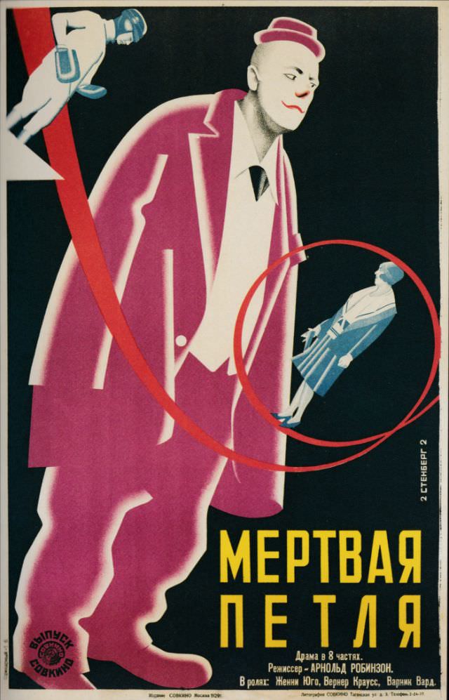
Films from the Soviet republics of Georgia and Central Asia also made their way into this poster tradition. Georgian directors like Mikhail Chiaureli and Kote Marjanishvili brought regional stories to Soviet screens, and their posters reflect the same dynamic graphic language applied to distinctly local subjects. The visual style was uniform; the subject matter was anything but.
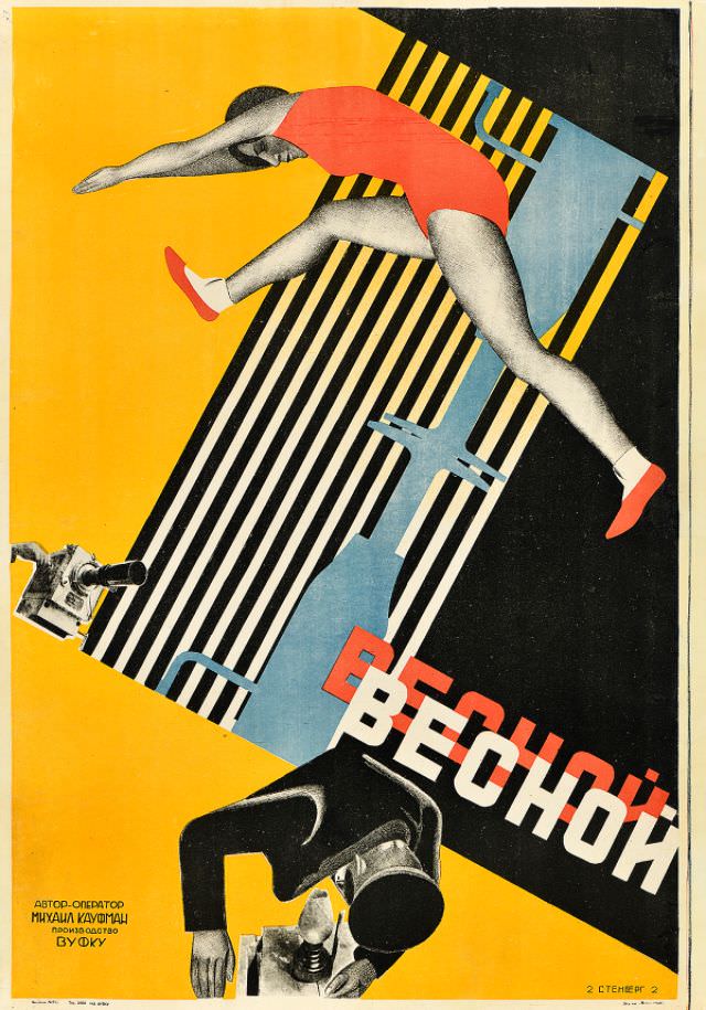
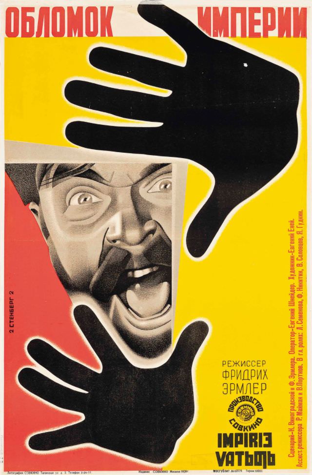
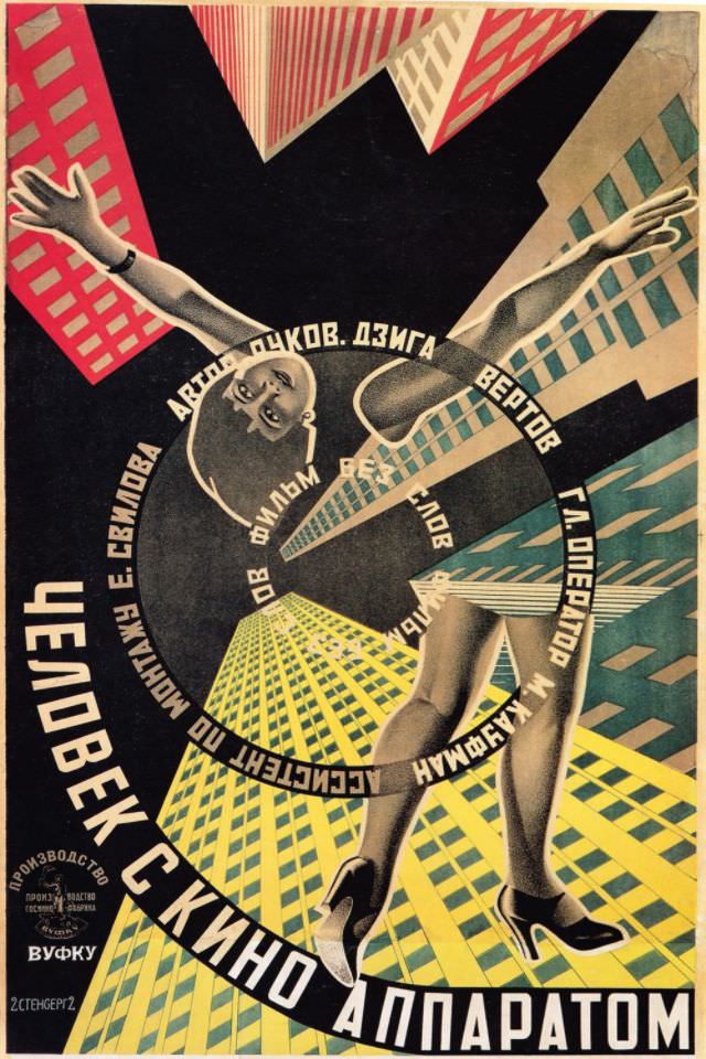
As the 1930s began, the Soviet government shifted toward Socialist Realism — a more rigid, representational style that replaced experimental art with approved imagery of heroic workers and party ideals. The freewheeling creativity of the 1920s gave way to tighter state control. The posters from 1933 and 1934 reflect this transition, showing a move away from abstraction toward more conventional, illustrative compositions.