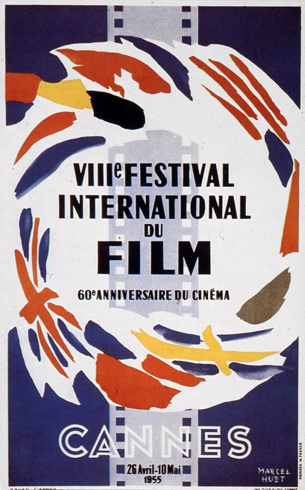
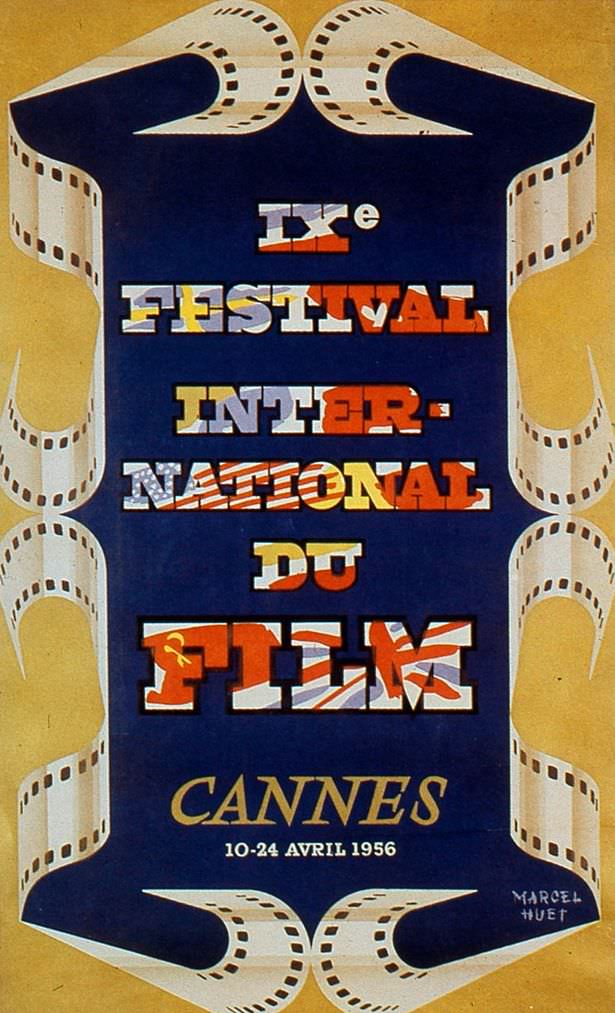
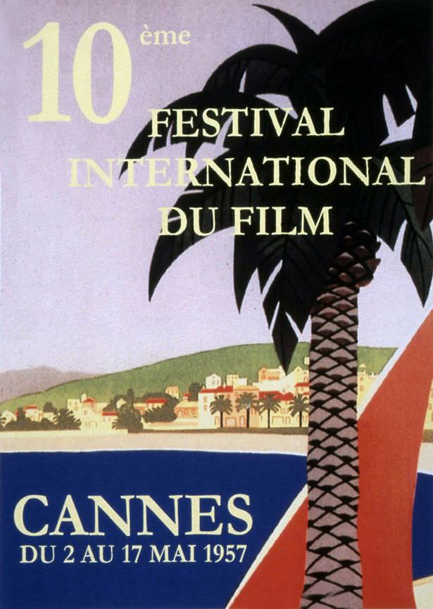
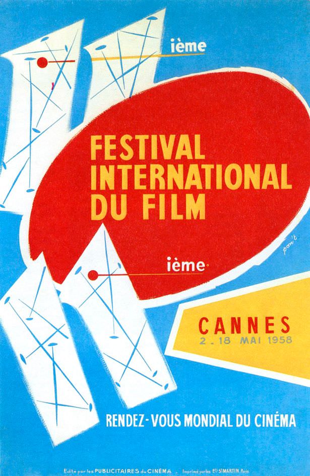
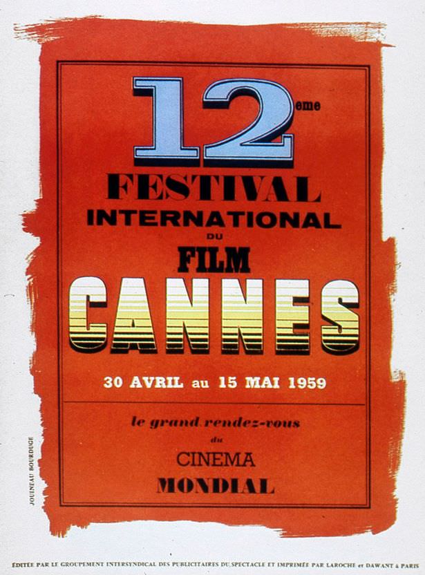
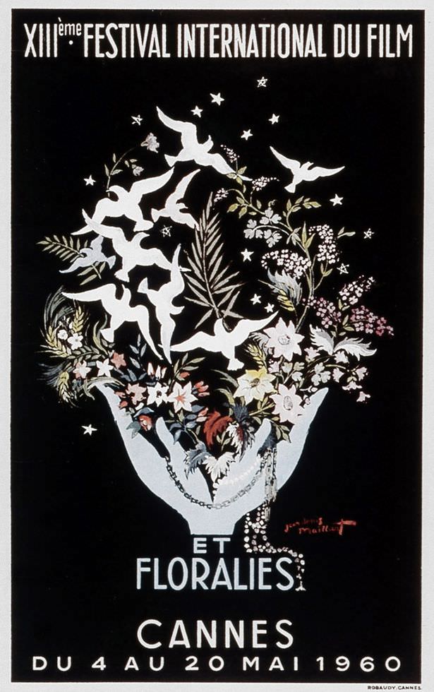
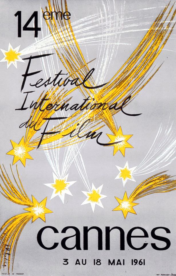
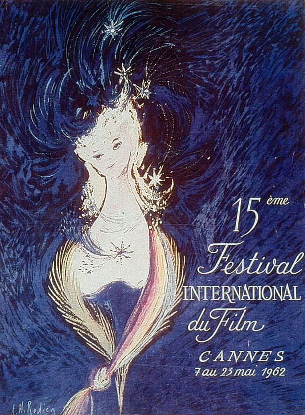
The Cannes Film Festival, held each year on the scenic French Riviera, stands as one of the most prestigious international events dedicated to the art of filmmaking. A key part of the festival’s identity each year is its official poster; a unique piece of artwork designed to announce and represent that year’s edition. Looking back at the vintage posters created for Cannes in its earlier decades provide a captivating glimpse into the history of graphic design and the evolving ways cinema itself has been portrayed.
Announcing the Festival
From its beginnings, the Cannes Film Festival poster served a clear purpose: to advertise the event to the world. These posters announced the dates, generated excitement, and visually captured the spirit of the upcoming festival. Often commissioned by notable artists and designers, each poster aimed to create a distinct visual identity for that specific year, becoming a collectible piece of memorabilia associated with the festival’s history.
Read more
Early Styles (Post-War – 1950s)
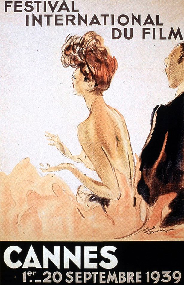
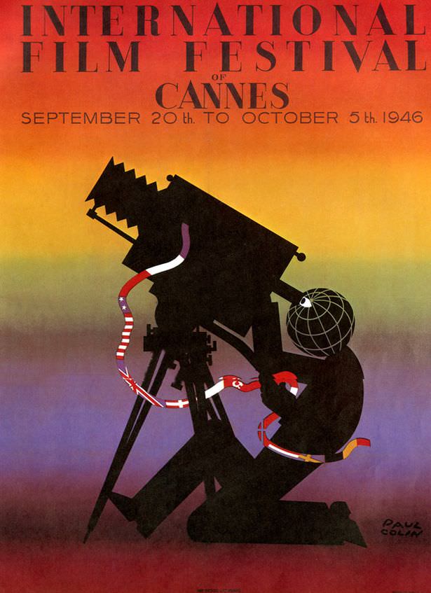
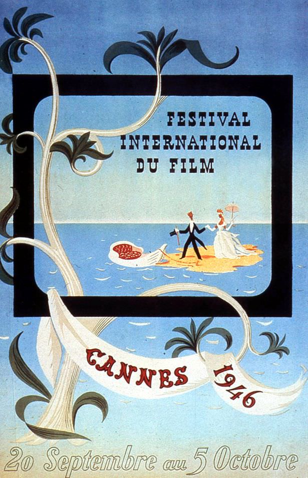
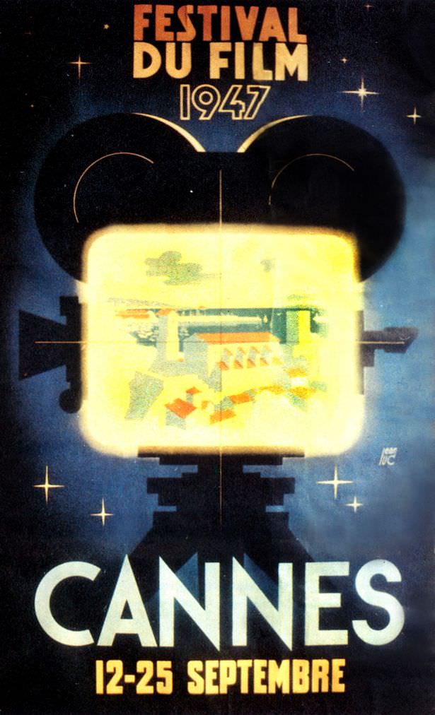
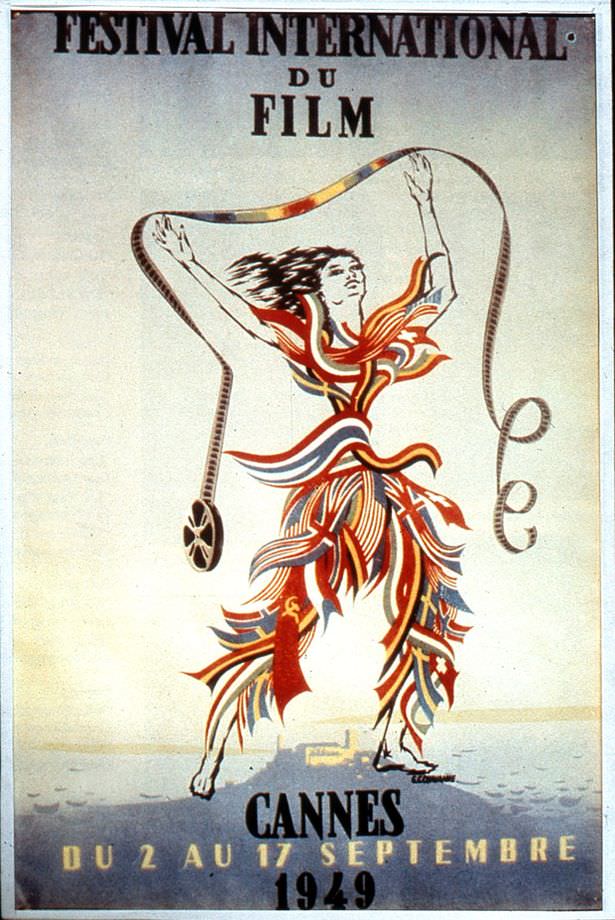
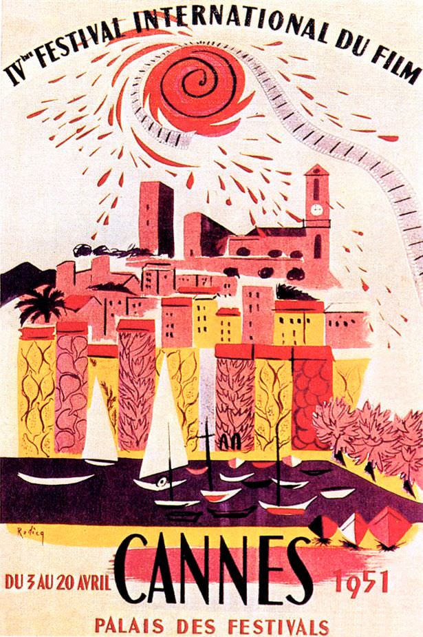
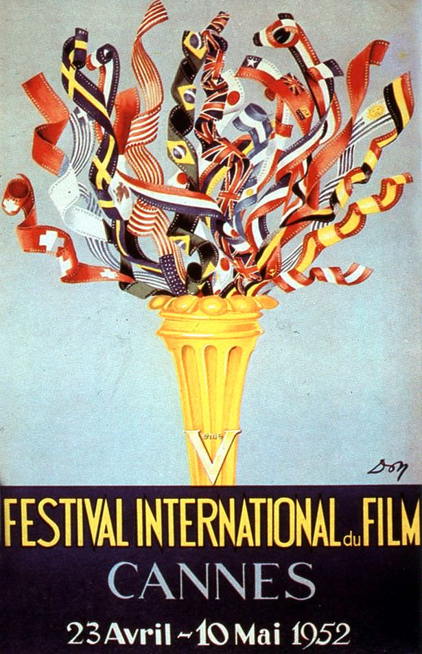
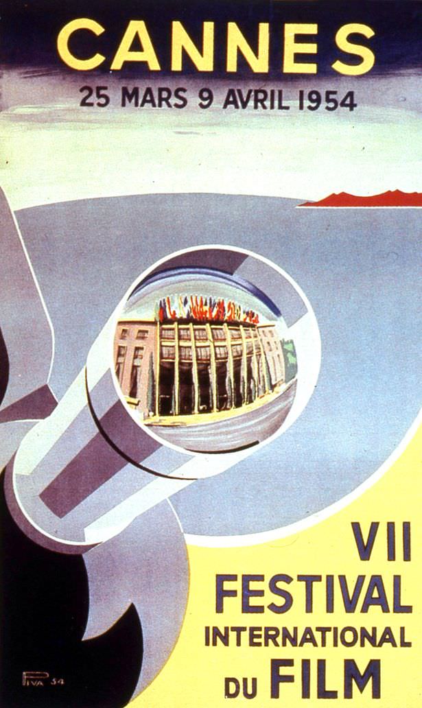
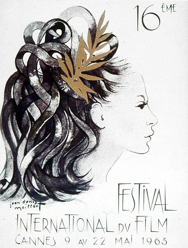
The first full Cannes festival took place shortly after World War II, in 1946. In these early years and through the 1950s, the official posters displayed an illustrative or painterly style. Some designs emphasized the glamour and allure associated with movies and movie stars. Others reflected the post-war context, incorporating symbols of peace, like doves, or celebrating international unity with flags from different nations. Common visual elements included direct references to filmmaking, such as film reels, movie cameras, or spotlights, often combined with imagery evoking the festival’s sunny Mediterranean location – palm trees, blue seas, and bright skies were frequent motifs. Artists like Jean-Gabriel Domergue were among those creating posters in these early styles.
Modern Looks Emerge (1960s)
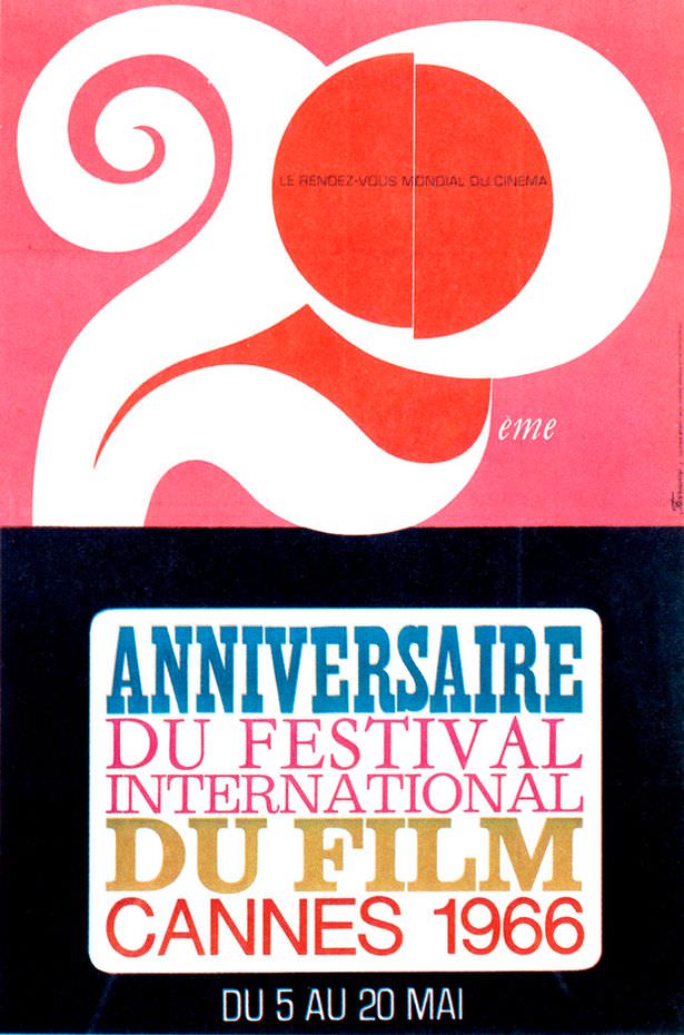
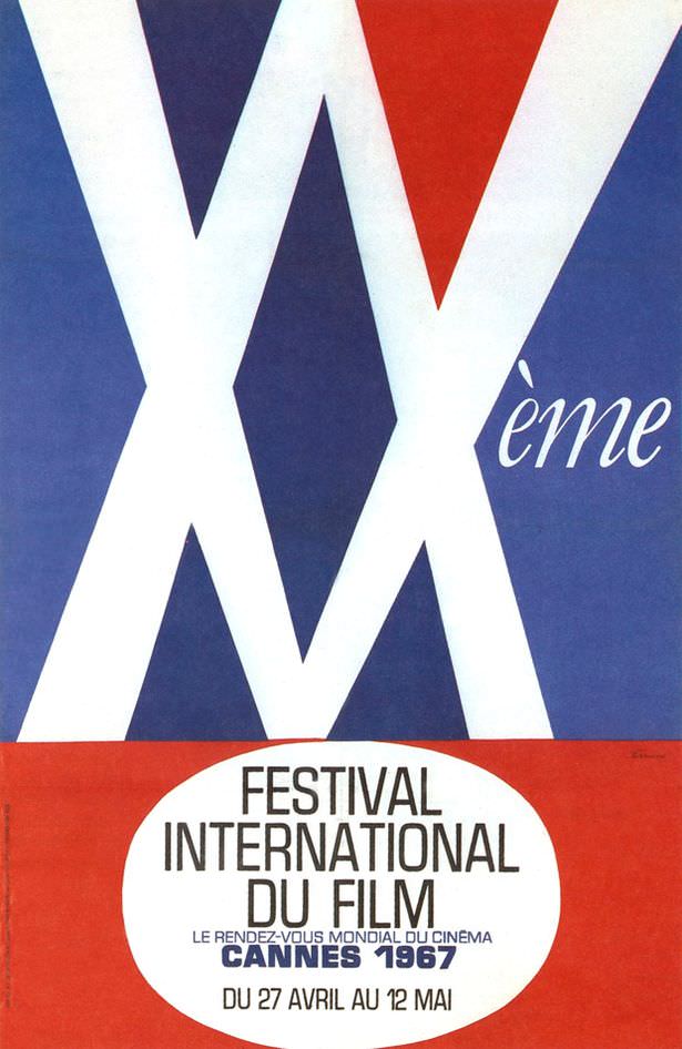
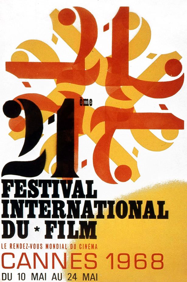
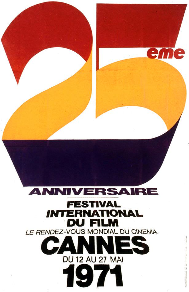
As the world moved into the 1960s, graphic design trends shifted towards modernism, and the Cannes posters reflected this evolution. Designs from this decade showed a move away from detailed illustration towards greater graphic simplicity, abstraction, and the use of bolder, flat areas of color. Typography – the style and arrangement of the text – also became more experimental and integrated into the overall design. Some posters used clever visual metaphors or minimalist approaches to represent cinema or the festival experience. Artists with strong ties to the festival, like the multi-talented Jean Cocteau, contributed designs, while graphic artists such as Jean-Michel Folon introduced distinctive and imaginative visual styles.
Further Evolution
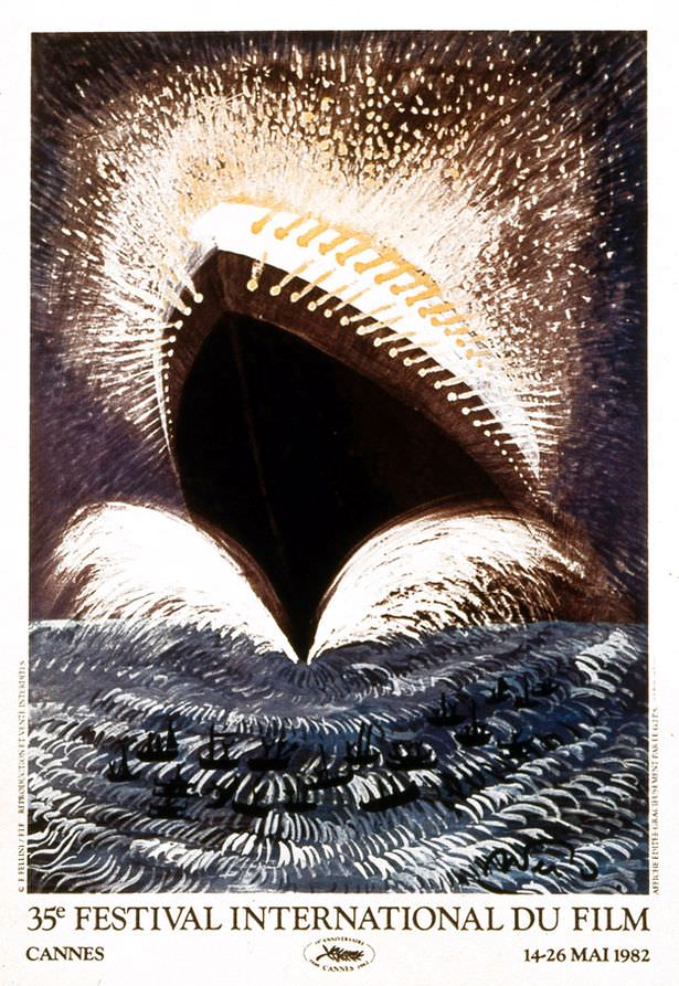
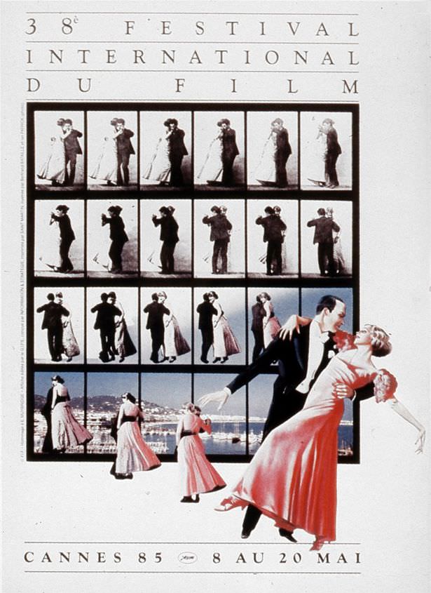
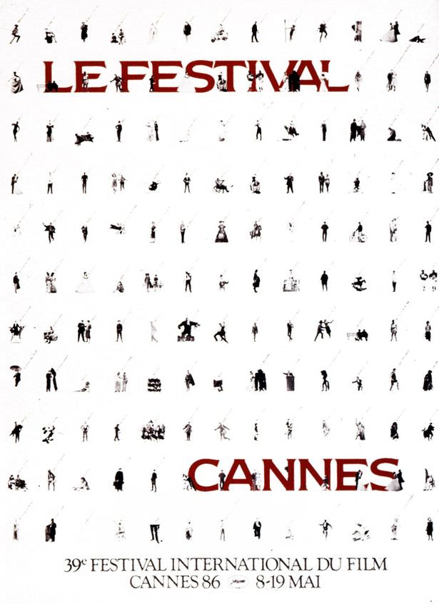
The experimentation and diversity in design continued into the 1970s and the following years considered part of the vintage era. Photography began to appear more regularly on the posters, sometimes used on their own, sometimes creatively combined with graphic elements or illustrations. The range of artistic styles broadened further, encompassing everything from playful and colorful graphics to more atmospheric or thought-provoking conceptual designs. Artists like Georges Lacroix created memorable posters during this period, showcasing the ongoing artistic engagement with the festival’s identity.


