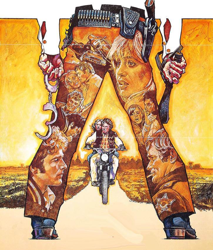
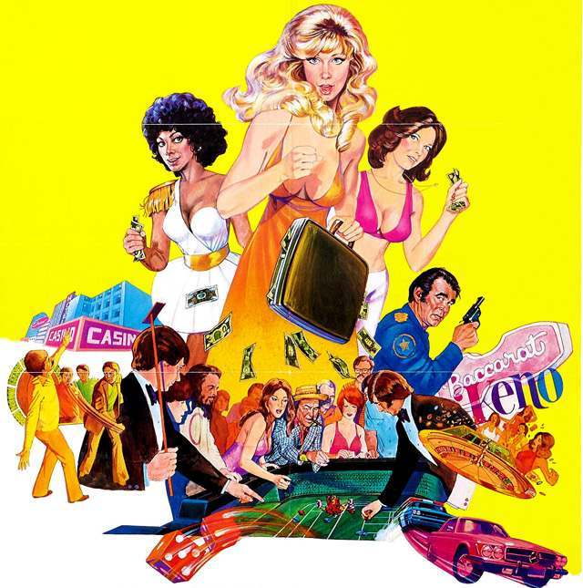
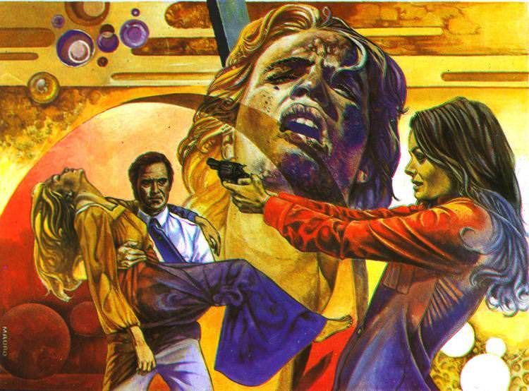
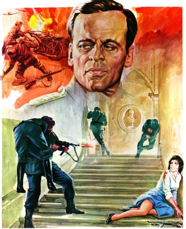
The 1970s were a golden age for movie poster art. Before digital tools existed, artists hand-painted every design. That process gave each poster a one-of-a-kind quality that mass production simply couldn’t replicate. The dominant style of the decade was the montage — a single image built from several scenes, characters, and moments pulled from the same film.
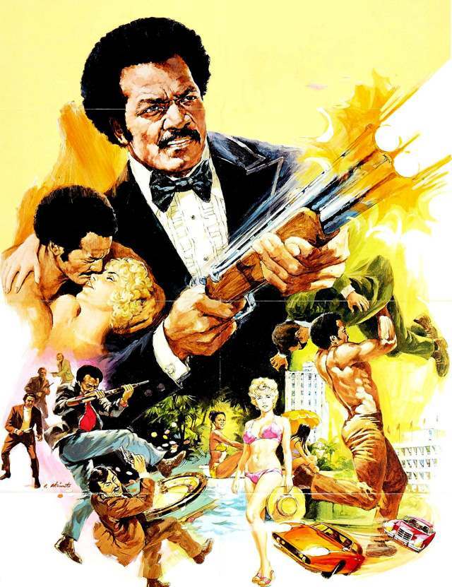
A montage poster could show an action sequence, a romantic moment, and a comedic scene all at once. This gave audiences a real sense of a film’s tone before they ever bought a ticket. Action films packed in chase scenes and explosions. Thrillers leaned on dramatic faces and shadowy figures.
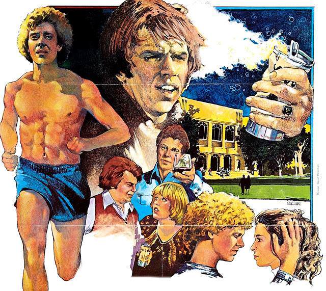
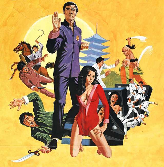
The bold colors and dynamic compositions weren’t accidental. Artists carefully arranged each element to pull the eye across the image. Sex, violence, and adventure were communicated clearly and without subtlety — that directness was the point.
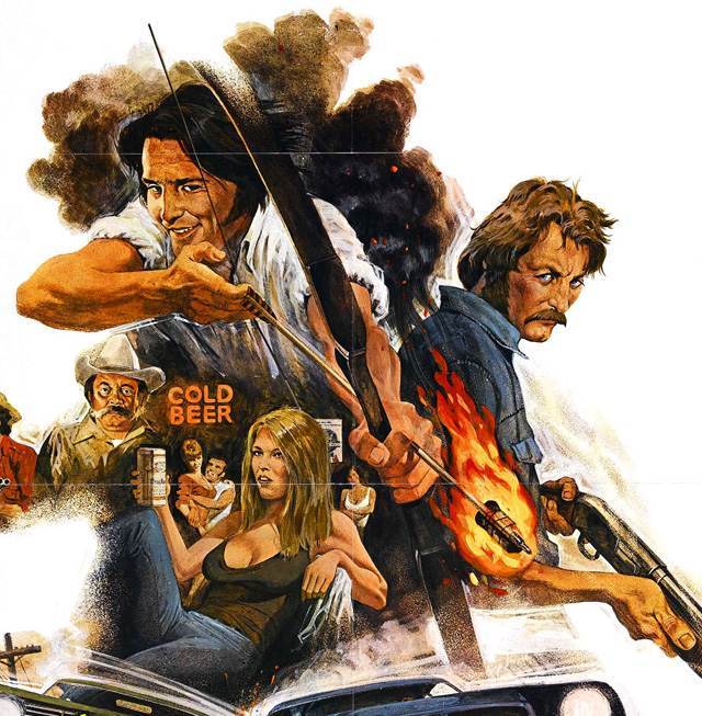
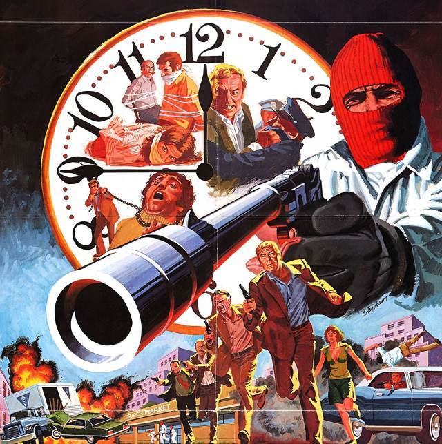
Genre films of every kind embraced the style. Kung fu movies, blaxploitation films, horror features, and car-chase thrillers all used it. The poster had to sell the film in a single glance — and these designs delivered.
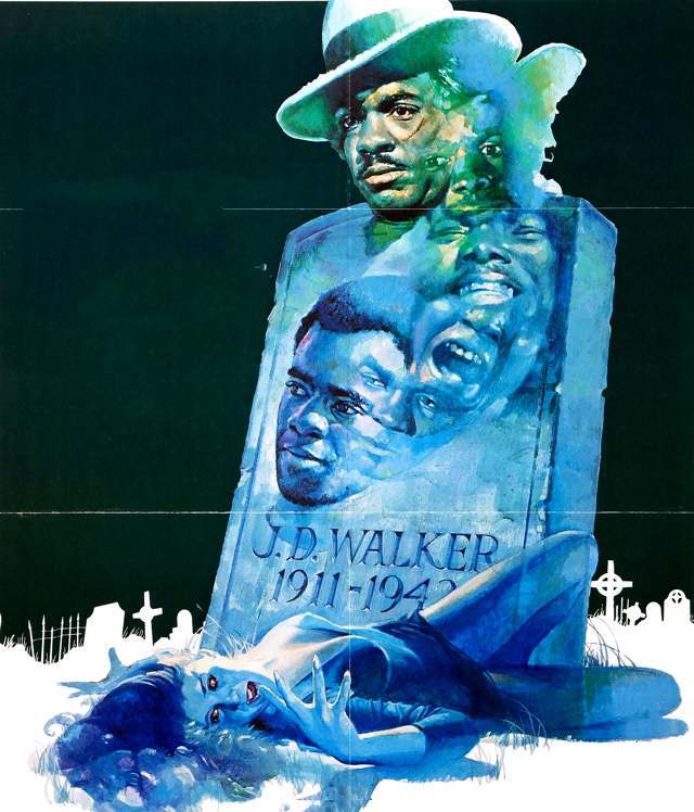
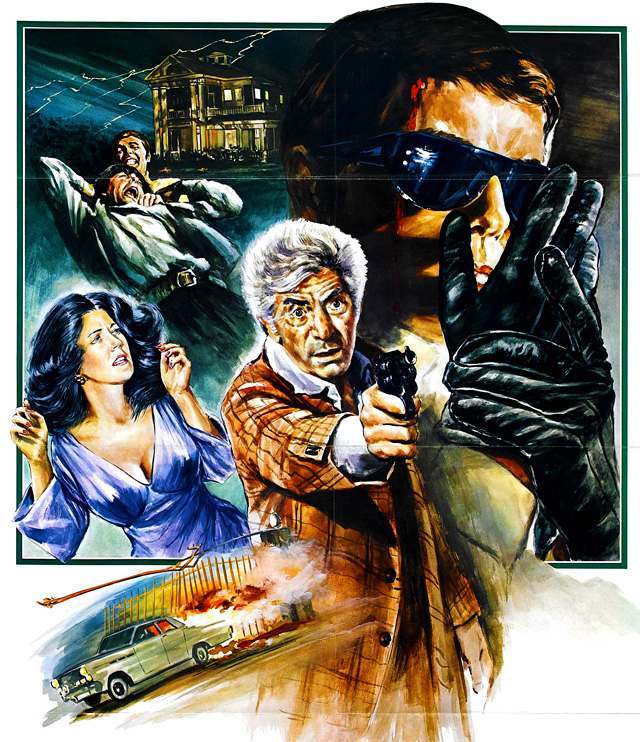
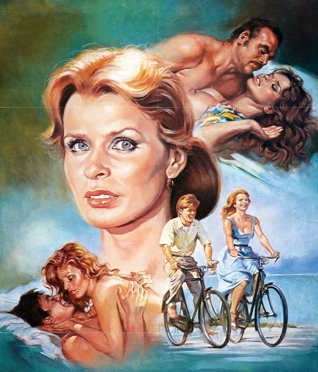
International productions joined in too. Films from Spain and Italy carried the same vibrant, painted energy as their American counterparts, proving the montage style crossed borders easily.
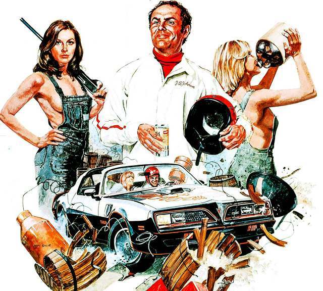
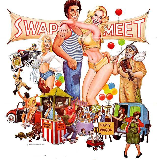
Drive-in and grindhouse films especially relied on eye-catching poster work. Their audiences were drawn in by the promise on the wall outside the theater. The more vivid the artwork, the bigger the crowd.
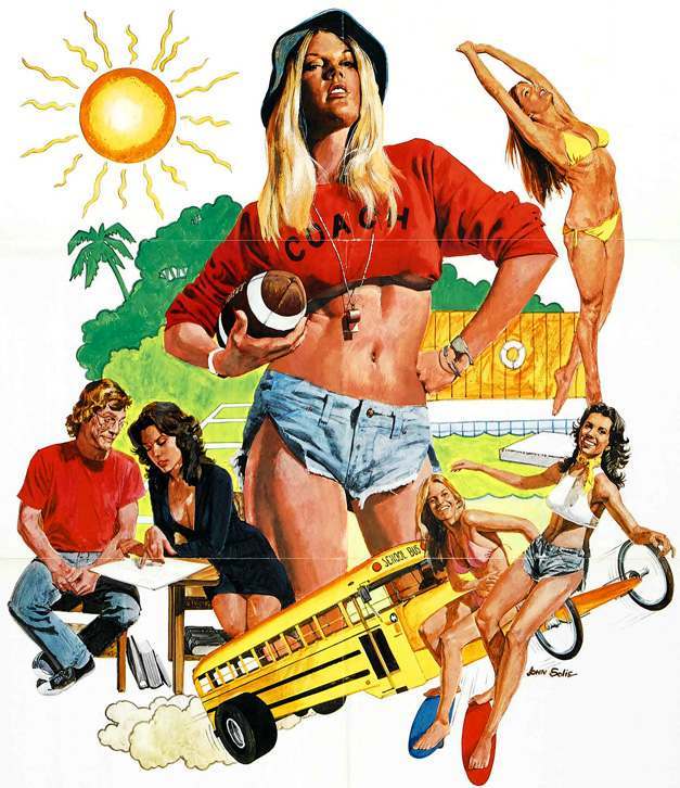
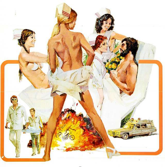
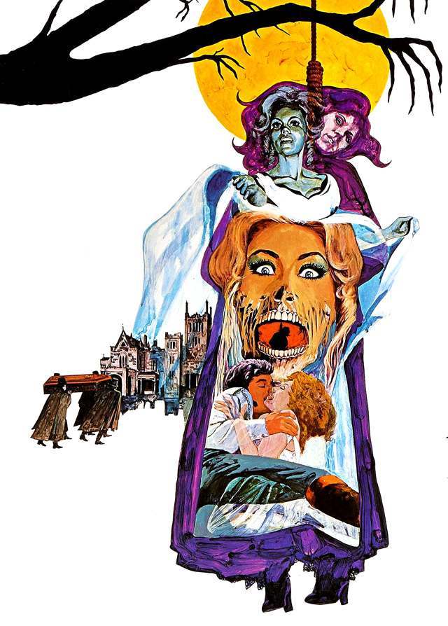
Every poster below represents a specific moment in film marketing history — when a skilled painter, a deadline, and a low budget produced something genuinely striking.